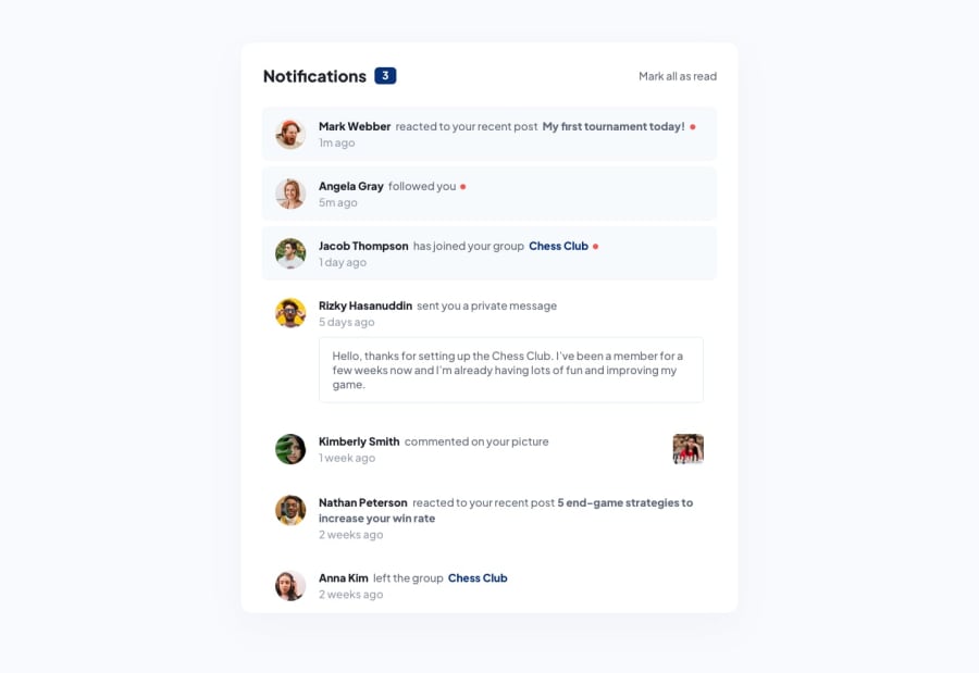
Responsive and accessible notification page using flexbox
Design comparison
Solution retrospective
I spent quite a bit of time thinking about semantic HTML for this project. I have a couple of questions regarding best practices:
- I treated the individual notifications as
<li>in an<ol>. For this project, this just leads to a more nested HTML structure, but was it still "correct" to do this, or should I have just treated the notifications as individual<section>'s? - I couldn't figure out a nice tag for the private message. I eventually went with
<p tabindex="0">so that it was still focus-able. Was there a better choice for this element?
Community feedback
- @orphandeityPosted over 1 year ago
I think you're on the right track here with the list and list item elements. I suggest using <article> instead of <section> for the individual notifications and maybe contain them all in a single <section> element.
  <section>
    <article></article>
    <article></article>
  </section>
You could also wrap the <article> in a <li> like so...
<ol>
  <li>
    <article></article>
  </li>
  <li>
    <article></article>
  </li>
</ol>
Because the private message is a type of notification and not an input field, I don't think it needs to be focusable. Usually, you would only want the interactive elements to receive focus... like the 'mark all as read' button.
Marked as helpful0
Please log in to post a comment
Log in with GitHubJoin our Discord community
Join thousands of Frontend Mentor community members taking the challenges, sharing resources, helping each other, and chatting about all things front-end!
Join our Discord
