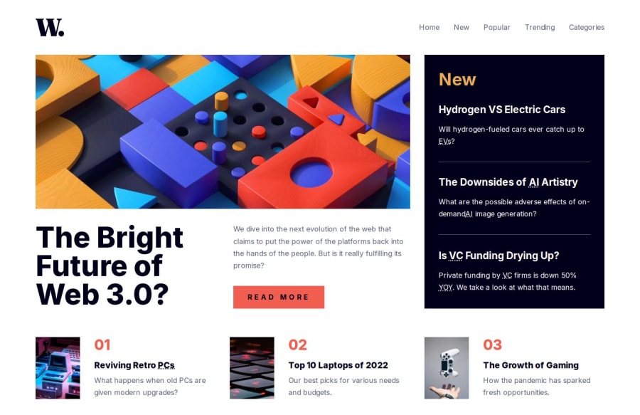
Responsive and accessible Grid Layout made with CUBE CSS methodology
Design comparison
Solution retrospective
This project was created using CUBE CSS methodology. I tried to separate CSS styles into Composition, Utilities, and Exceptions folders. Also, I worked on making it more accessible.
What challenges did you encounter, and how did you overcome them?1.) When menu sidebar appears for mobile devices, I would like to know how the Menu Close icon, in the upper right corner, gets focus first. Also I would like to get some tips on how to improve accessibility even more. 2.) Should I give role attributes to every div and span? Also, do the nav and ul tags also need role attributes?
Community feedback
- @YacoubDweikPosted 6 months ago
Hey! Good job!
In screens less than 700px I scroll to see the rest of the content bcuz of The overflow hidden for the body.
Also the effect of that black shadow when you click on the menu is not the best tbh you can achieve it in a better way.
Try to get more comfortable with responsive designs, try using mobile-first approach
Marked as helpful1P@DavidPokrajacPosted 6 months ago@YacoubDweik Thanks for the feedback. I will try to handle that as soon as possible.
1P@DavidPokrajacPosted 5 months ago@YacoubDweik Hey, I did some work, in case you're interested here's the link: News Homepage Component
1@YacoubDweikPosted 5 months ago@DavidPokrajac No sorry I am not interested and do not call this number again hahaha!!
Yaay! ahaa you see now it is much much better!
Just add a small margin or padding for the last section on destop screens and here you go! well done Luka Modric!
Marked as helpful1P@DavidPokrajacPosted 5 months ago@YacoubDweik yeah I will have to upgrade to Pro version to have access to Figma files, this way is too difficult :D. Thanks for all the help man :) nice sense of humor also. Haven't seen that here yet.
1 - @xNyfPtxPosted 6 months ago
No, you rarely only need to use the
role=""attribute. Navs and uls are already semantic but I've heard about of usingrole="list"on ul and ol because Safari do some wild stuff. Divs and spans are only there for presentation but there are some cases where you would need to use a role attribute for it like a tablist. Check this and thisMarked as helpful1P@DavidPokrajacPosted 6 months ago@geomydas Thank you very much for your feedback
0
Please log in to post a comment
Log in with GitHubJoin our Discord community
Join thousands of Frontend Mentor community members taking the challenges, sharing resources, helping each other, and chatting about all things front-end!
Join our Discord
