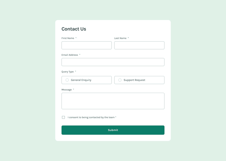
Design comparison
Solution retrospective
Writing accessible markup was challenging. The screen reader would not read out error messages if the same error was made more than once (this happened when I used aria-live attribute for error messages). So, to solve that, I put the error message for screen reader inside `` and hid them using CSS.
Now every time an error is committed, the invalid field gets focused automatically and as its focused, the screen reader automatically reads out the label (and hence the error messages).
What specific areas of your project would you like help with?What changes should I make to the flash message to fix this behavior?
Windows Narrator reads out all the contents of the flash message when form is opened in Firefox but in Brave (and possibly other Chromium browsers) it just reads the first line.
Community feedback
Please log in to post a comment
Log in with GitHubJoin our Discord community
Join thousands of Frontend Mentor community members taking the challenges, sharing resources, helping each other, and chatting about all things front-end!
Join our Discord
