Submitted over 1 year ago
Responsive and Accessible Blogr Landing Page
@abhijithmuthyala
Design comparison
SolutionDesign
Solution retrospective
What did I implement?
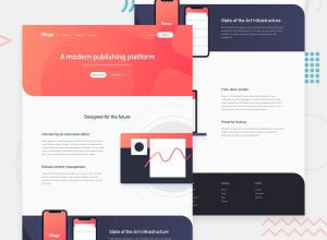
- Responsive design (sass + css variables).
- Aim to match the design (used Polypane browser).
- Modified the mobile menu design slightly and added vertical scrollbar.
- I tried the
:hasselector in this challenge. It wasn't strictly neccessary, and it looks like it only works correctly in Chrome as of now, but I wanted to try it anyway. - Images - Tried to use pseudo elements with background images for illustratory images, instead of the <img /> HTML element.
- Accessible - Tried to implement the disclosure pattern recommended by W3C for the menu button and also the submenu links. Tested with NVDA screen reader.
- MVC Architecture - Implemented the navigation submenus using the MVC pattern. The "state" in the model is the single source of truth.
What can be done better?
- I had a hard time identifying the right colors, so I didn't use all of the colors provided in the style guide.
- Background image of hero section - it doesn't exactly look like in the design.
- Implement focus trapping within the mobile menu.
Any feedback, specifically on the MVC implementation, is much appreciated. Thank you!
Community feedback
Please log in to post a comment
Log in with GitHubJoin our Discord community
Join thousands of Frontend Mentor community members taking the challenges, sharing resources, helping each other, and chatting about all things front-end!
Join our Discord
