
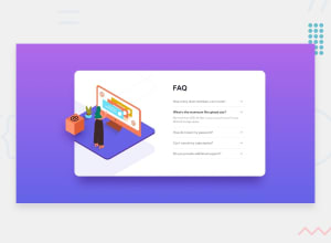
Responsive and Accessible Accordion Card using HTML, SASS and JS

Design comparison

Solution retrospective
I am happy I have been able to get this far. I struggled a lot with the background positioning of the patterns and then with the illustration woman and box. I decided to show what I have now and ask for help on how to properly do this.
My issue with the illustration for the mobile was having it stick to the top of the container even with different screen sizes. I used percentages in the absolute positioning for this but it did not seem to work past around 300px screen sizes and below.
The illustration box also does not stay in one place. I tried using position: fixed and it did not work as I wanted it to. I'll appreciate help on my positions for the different screen sizes.
Also, feedback on accessibility is welcome.
Community feedback
- @nenadmnePosted about 2 years ago
Container has
overflow:hiddenso left half of your box is hidden outside of container, because its position is relative to parent who has hidden overflow. Simple solution would be that parent for the box image is body, so its wraped out of overflow.body::afterThere is probably 20 more solutions arround just pointing out the most newbie one0@mbonamensaPosted about 2 years ago@nenadmne Yeah, I tried this, but on the
mainwhich is outside of theoverflow: hiddenand the absolute positioning does not stay in one place when the screen is resized.0@nenadmnePosted about 2 years ago@mbonamensa it will always change as long as you dont make specific width and height to the box parent container. Why? Because you say i want box to be
left:-68pxfrom my parent container. And when you resize parent container it will move diferently around. IF your parent has 300px width or 600px width is making difference. So you need to make strict width and height of.containerand it will always be in same place in resposive way. Curently your width is at 85% width of the screen.0@mbonamensaPosted about 2 years ago@nenadmne Ohh okay, this makes sense. That means my width has to be fixed which will affect responsiveness as well, no?
0@nenadmnePosted about 2 years ago@mbonamensa yes, fix the width/height. No units that are changable, anything changable like
%will change box too becuz its dependent on them.0@mbonamensaPosted about 2 years ago@nenadmne Right, thank you for your help!
0

Please log in to post a comment
Log in with GitHub
Join our Discord community
Join thousands of Frontend Mentor community members taking the challenges, sharing resources, helping each other, and chatting about all things front-end!
Join our Discord