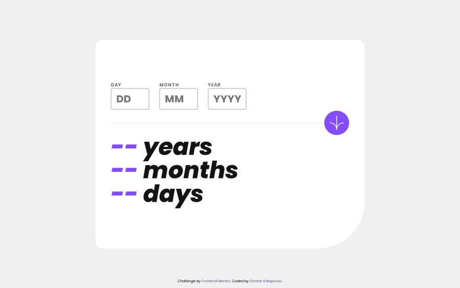
Design comparison
Solution retrospective
The most difficult part about this was calculating the days because of the different lengths of months. Have another solution, feel free to share it with me!!
Community feedback
- @0xabdulkhaliqPosted almost 2 years ago
Hello there 👋. Congratulations on successfully completing the challenge! 🎉
- I have other recommendations regarding your code that I believe will be of great interest to you.
HTML 🏷️:
- This solution may cause accessibility errors due to lack of semantic markup, which causes lacking of landmark for a webpage and allows accessibility issues to screen readers, due to accessibility errors our website may not reach its intended audience, face legal consequences, and have poor search engine rankings, highlighting the importance of ensuring accessibility and avoiding errors.
- What is meant by landmark ?, They used to define major sections of your page instead of relying on generic elements like
<div>or<span>. They are use to provide a more precise detail of the structure of our webpage to the browser or screen readers
- For example:
- The
<main>element should include all content directly related to the page's main idea, so there should only be one per page - The
<footer>typically contains information about the author of the section, copyright data or links to related documents.
- The
- So resolve the issue by replacing the
<div class="container">element with the proper semantic element<main>along with<div class="attribution">into a<footer>element in yourindex.htmlfile to improve accessibility and organization of your page
.
I hope you find this helpful 😄 Above all, the solution you submitted is great !
Happy coding!
Marked as helpful0@DimitarK13Posted almost 2 years ago@0xAbdulKhalid Thank you very much for your recommendations, I will make sure to apply them to my code.
0 - @daniel-web-developerPosted almost 2 years ago
I've also had a problem getting the dates right. After some research, I came across a JavaScript library called Datejs. This is how I've done it:
- I got the dates (from today) using the Date library that comes with JavaScript and stored each in a different variable;
- I then used a function from Datejs that adds (so you have to use a minus sign to subtract) the date entered by the user.
That's pretty much it. Coming up with an algorithm is really hard and time consuming so I think it's better to just to use a library instead.
Marked as helpful0@DimitarK13Posted almost 2 years ago@daniel-web-developer Thank you Daniel, I will keep this is mind for a later project.
0 - @Saad-HishamPosted almost 2 years ago
Hey there!
I just wanted to say that your design is stunning and the validation is perfect! I do have a couple of tips that might help make it even better:
Firstly, for improved accessibility, it's better to wrap your app inside the <main> tag instead of the <div>.
Secondly, the width and height of your app don't seem to match the design. Here are the correct dimensions that you can use:
div{
    width: 842px;
    height: 651px;
}
If you're wondering how to get the correct dimensions without using a sketch file, you can use software like Photoshop, and it will help a lot.
On mobile screens, the inputs aren't in a row and break because of the sizes. To fix this, you can give the inputs specific sizes in the design, like this:
Just a quick note: When designers create mobile designs, they typically work with a standard size of 375px. That means, if you're developing a mobile app or website, it's a good idea to keep this size in mind when implementing the design.
.inputs > div {
    width: 81px;
}
.inputs input {
    width: 100%;
}
Marked as helpful0@DimitarK13Posted almost 2 years ago@Saad-Hisham Thank you very much, appreciate the tips!
1
Please log in to post a comment
Log in with GitHubJoin our Discord community
Join thousands of Frontend Mentor community members taking the challenges, sharing resources, helping each other, and chatting about all things front-end!
Join our Discord
