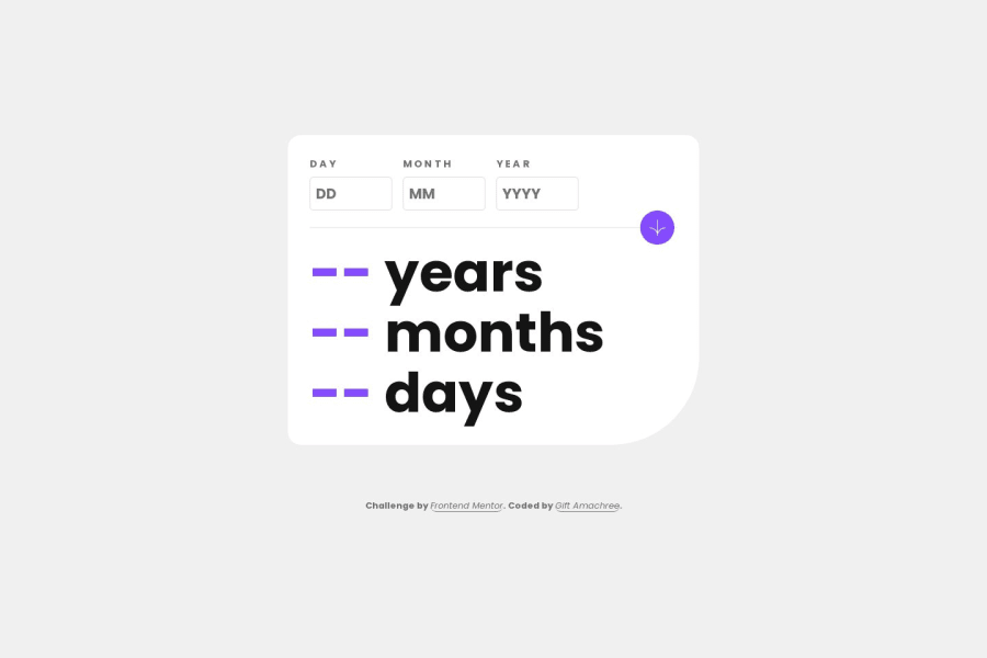
Responsive age calculator app with html, css and javaScript
Design comparison
Solution retrospective
I've just wrapped up this project, and I must say, your insights and contributions are truly invaluable.
Community feedback
- P@Mazhar1857Posted 12 months ago
In your age calculation, it would be great if you could include day validation for months with 30 or 31 days, as well as validate February month for leap years.
Marked as helpful0 - @iamtridwanPosted about 1 year ago
Hi @jen67! I just went through your project now (both the live deployment and code)and i must say you really nailed it in the aspect of design specification as well as responsiveness. Great job. One thing i noticed tho, is with the functionality with the calculations. whenever i enter a date i get this continous calculation of number, which inturn makes the whole UI glitching giving a bad experience. A way to resolve this issue is to address the calculations for the age. one way to do that is as follows
- since we have the current date and the inputted date we can just convert them to milliseconds and get thier difference. below is a sample code
let ageInMilSec = new Date().getTime() - new Date(inputedDate).getTime()the getTime method of the date object returning time in milliseconds 2. calculate the number of years in the remaining milliseconds. this can be done like so
const years = Math.Floor(ageInMilSec / 31556952000)since there are 31,556,952,000 in a year. 3. calculate for the month as so:
const month = Math.floor((ageInMilSec % 31556952000) / 2629746000)what we did was divide the remainder from what we got by dividing the age in milliseconds by the total miiliseconds in a year, by the milliseconds in a month 4. you can get that of the day by doing so
const day = Math.floor(((ageInMilSec % 31556952000) % 2629746000) / 86400000)there are 86,400,000 in a day. so what we did was divide the result we get from the remainder of month divided by its own milliseconds. Hope this helps. if you have any further assistance or question you can reachout to me on @iamtridwan on X.
Marked as helpful0 - P@danielmrz-devPosted about 1 year ago
Hello @jen67!
You did a very good job there!
I have a very simple suggestion for improvement:
- Since the arrow button is a clickable element, it's nice to add
cursor: pointerto it.
📌 This gives the user a visual indication that the element is clickable, as obvious as it may look.
I hope it helps!
Other than that, you did a great job!
Marked as helpful0 - Since the arrow button is a clickable element, it's nice to add
Please log in to post a comment
Log in with GitHubJoin our Discord community
Join thousands of Frontend Mentor community members taking the challenges, sharing resources, helping each other, and chatting about all things front-end!
Join our Discord
