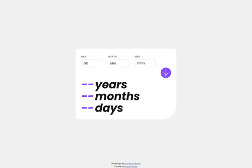
Responsive Age Calculator App usign HTML,CSS and JavaScript

Solution retrospective
This challenge was way too frustrating for me, and I almost give up but after taking a break for a while I had an idea for the calculation, and I went on with the flow which was successful. I put the whole calculation in a single JS function which was a bit hard to read but then I broke down the function into smaller parts which I surely am proud of how clean my whole code looks like. I started coding as soon as I saw the challenge, but this is absolutely not my recommendation what I like to do next time is that first of all I would learn about the challenge properly and learn a few tips and tricks before I start the challenge.
What challenges did you encounter, and how did you overcome them?I started the challenge, but I had absolutely no idea how this should look like. I was just exited to finish this challenge without reading some tips or knowing how this program should function like which was a big mistake and made this challenge way too difficult and frustrating but I somehow managed to complete the challenge. And I won't ever do this mistake again.
What specific areas of your project would you like help with?I would really appreciate if some expert would review my code and advise me on how I can write better code or what should I change to become better. Thanks.
Please log in to post a comment
Log in with GitHubCommunity feedback
No feedback yet. Be the first to give feedback on Shoaib Shuja's solution.
Join our Discord community
Join thousands of Frontend Mentor community members taking the challenges, sharing resources, helping each other, and chatting about all things front-end!
Join our Discord