Design comparison
Solution retrospective
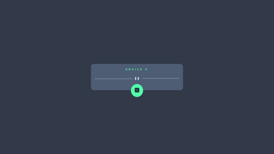
First time using an API and it was very fun. All advice is welcome and appreciated, I could always improve 😁.
Community feedback
- @awexliPosted over 2 years ago
Hey @yhas14, nice solution!
One thing you can do to improve user experience is to implement a loading indicator (such as a spinner animation, or even the word "loading..") while we wait for an advice to return from the fetch. This lets the user know something is happening in the background.
If you're feeling ambitious you can also implement something to let the user know they'll need to wait X amount of seconds before a new quote is fetched. Try pressing the button in quick succession and you'll notice it takes some time to update. This happens because
api.adviceslip.com
caches request, and any repeat-request within 2 seconds will return the same piece of advice -- most likely because they don't want anyone to overload the api service 😉Good luck!
Marked as helpful0@yhas14Posted over 2 years ago@awexli That's a great idea and I was trying to find a solution for dealing with that. I'll take your advice on implementing a loading icon. To be entirely honest I don't even know where to start how to implement that but I'll do some research. Thank you Alex.
1 - Account deleted
Hello there! 👋
Congratulations on finishing your challenge! 🎉
I have some feedback on this solution:
-
put the quote inside a <blockquote> tag instead of p to be more semantic
-
check the HTML report to fix accessiblity issues
i hope this is helpful and goodluck!
Marked as helpful0@yhas14Posted over 2 years ago@Old1337 Thank you! I need to work on accessibility for sure. I focus too much on styling that I always forget that.
1 -
Please log in to post a comment
Log in with GitHubJoin our Discord community
Join thousands of Frontend Mentor community members taking the challenges, sharing resources, helping each other, and chatting about all things front-end!
Join our Discord