Submitted almost 2 years ago
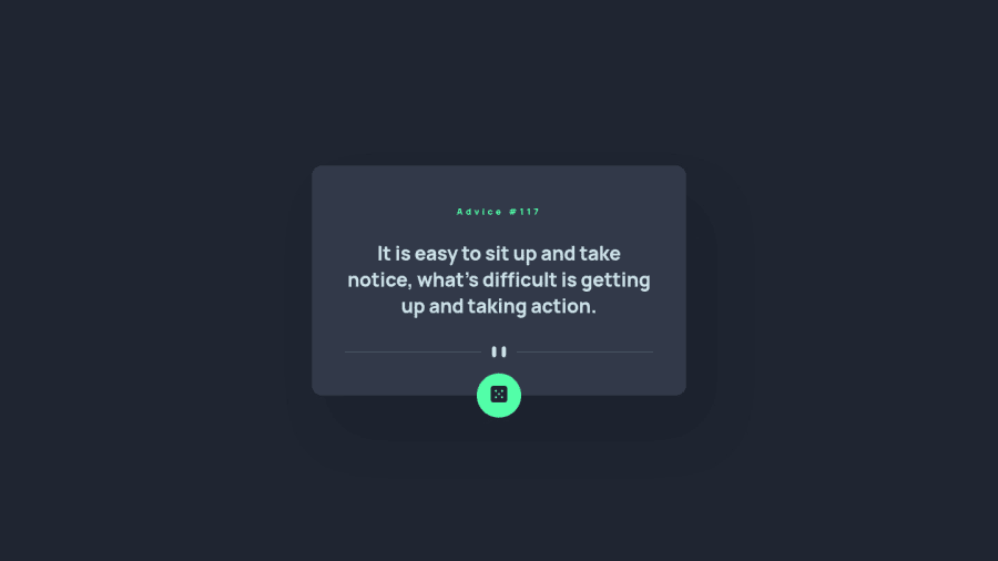
Responsive Advice generator in React
#react#axios
P
@jbaldwin406
Design comparison
SolutionDesign
Solution retrospective
Fun little project to practice with. I would consider this more of a component of an app, not an app in and of itself so may have some warnings about not having main landmarks.
Community feedback
Please log in to post a comment
Log in with GitHubJoin our Discord community
Join thousands of Frontend Mentor community members taking the challenges, sharing resources, helping each other, and chatting about all things front-end!
Join our Discord
