Responsive Advice Generator App using React and CSS Grid
Design comparison
Solution retrospective
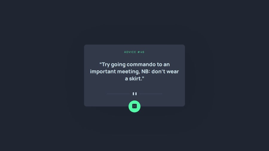
I used CSS variables for theming and applied a box-shadow effect on the adviceContainer. Drop-shadow caused text to be invisible on iOS webkit. Are there any best practices I might have overlooked or additional CSS techniques that could enhance the visual appeal or performance of my app?
Community feedback
- @petritnurediniPosted 10 months ago
First of all, congratulations on completing your project! It's always an achievement to bring a concept to life, especially in the world of web development. Now, let's dive into some best practices that could enhance your project even further.
Code Organization and Readability:
- Consistency in Import Statements: In your
App
component, you've imported./components/AdviceDisplay
without assigning it to a variable, which is unnecessary since you've importedAdviceDisplay
correctly in the following line. Ensuring consistency and avoiding redundant imports can make your code cleaner and more readable. - Use of Comments: It's great to see comments in your code, like in the
useEffect
hook. Continue this practice to explain complex logic or reasons behind certain implementations, making your code more understandable for others (and for yourself when you revisit it later).
React Best Practices:
- Handling Asynchronous Operations: In
handleFetch
, you've correctly used try-catch for error handling. Consider adding a loading state to manage UI during data fetching, enhancing user experience. - Prop Types: For larger applications, using prop-types or TypeScript for type checking can prevent bugs related to incorrect prop usage.
CSS and Styling:
- Responsive Design: Your media query for desktop styles is a good practice. Keep focusing on responsive design to ensure your application looks great on all devices.
- CSS Variables: You've effectively used CSS variables for colors. This is a great practice for maintaining a consistent theme and makes it easier to change colors universally.
Performance:
- Optimizing Images: Make sure images like the one in
FetchButton
are optimized for the web to improve load times, especially for users with slower internet connections.
Accessibility:
- Alt Text for Images: Great job providing alt text for images! This is crucial for users who rely on screen readers.
Continued Learning:
- For deeper understanding of React and best practices, the React official documentation is an invaluable resource.
- To learn more about CSS best practices, especially for responsive design, MDN Web Docs offers comprehensive guides.
- For performance optimization, Google's web.dev provides excellent insights and tips.
Keep up the great work, and remember that each project is a step forward in your development journey. Your progress is commendable, and with continued learning and application of best practices, your skills will only grow stronger!
Marked as helpful1 - Consistency in Import Statements: In your
Please log in to post a comment
Log in with GitHubJoin our Discord community
Join thousands of Frontend Mentor community members taking the challenges, sharing resources, helping each other, and chatting about all things front-end!
Join our Discord