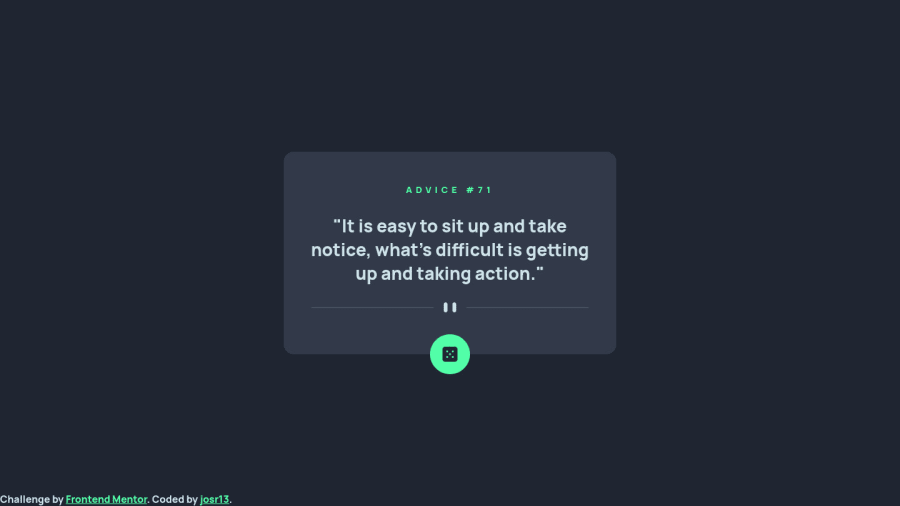
Responsive advice generator app using Fetch API, Sass, Flexbox & BEM
Design comparison
Solution retrospective
Hello. How can I make the divider SVG move down or make the card height larger when the quote takes too many lines, like 4 or more? Right now it overlaps the divider.
Community feedback
- @ABojoPosted over 1 year ago
The project looks great! Here are a few suggestions to solve your problem.
-
You're setting the height of the card explicitly which stops it from growing to fit the content. You should remove the height you set on the card so it can grow and shrink according to what's inside of it.
-
The divider isn't moving down because you've set the position to absolute. When you set an element's position to absolute it is pulled from the document's flow and will be unaffected by other elements. If you want the divider to move down as the quote gets larger you should leave its position alone and give it a top margin to create some space.
-
Don't forget to use padding to control the space between the card's content and border. You've set a top margin on the advice number when it would be better to pad the card container. Padding will be helpful to create space between the divider and the button at the bottom of the container.
If I wasn’t clear or you have any more questions feel free to let me know.
1 -
Please log in to post a comment
Log in with GitHubJoin our Discord community
Join thousands of Frontend Mentor community members taking the challenges, sharing resources, helping each other, and chatting about all things front-end!
Join our Discord