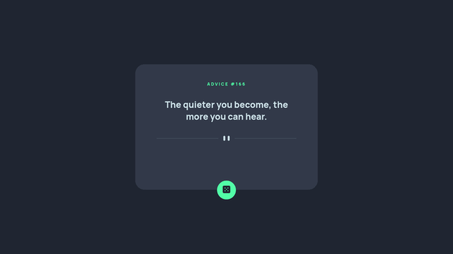
Responsive Advice Generating App with HTML, CSS and JS
Design comparison
Solution retrospective
Hi everyone!
This was my first time working with an API independently (without following a tutorial). It was quite straightforward and really helped me build confidence to take on bigger challenges with APIs.
My biggest struggle was with the positioning of the button. I am not really happy with how I solved it, and I will look into other solutions to find something more efficient. If you have any advice, I am happy to hear it.
Any feedback is welcomed and appreciated. Thank you in advance!
Community feedback
- @miranleginPosted over 2 years ago
Hi Gabriela,
congratulations on completing this challenge!
I have couple of suggestions to make this even better in my opinion.
- styling elements based on their name instead of css value is not flexible because i would suggest that you use
<q>instead of<h2>for the quote itself. Not only it is better from semantic point of view but the added benefit is that you get quotation marks by default. More info here - remove the height completely like previous commenter explained because when working with dynamic data you can never know how much of a text there is
Keep coding!
Cheers, Miran
Marked as helpful1 - styling elements based on their name instead of css value is not flexible because i would suggest that you use
- @dwhensonPosted over 2 years ago
Hello Gabriella,
Lovely job here! In response to your button challenge here is what I would do:
- Remove the fixed height from the
square-background. I would suggest in general to avoid setting heights if possible and use content, and if needed padding, to create a larger element. - On the button, remove the absolute positioning, and add
transform: translateY(50%), and that should do it.
Transforms to position an element are great as they don't impact performance, and unusually for CSS, the percentage refers to the element being targeted, not its parent.
So in this case we are telling the element to move down 50% of its height. Which is about where you want it I think? This also avoids hard coding pixel values which can make responsive design pretty tricky.
Hope this helps and nice work on the
fetchcall. Nice that you got some JS working!Cheers Dave
Marked as helpful1 - Remove the fixed height from the
Please log in to post a comment
Log in with GitHubJoin our Discord community
Join thousands of Frontend Mentor community members taking the challenges, sharing resources, helping each other, and chatting about all things front-end!
Join our Discord
