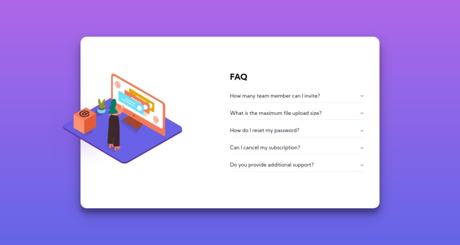
Responsive accordion component built with HTML5 and CSS3 (no JS)
Design comparison
Solution retrospective
In order to move the illustration image as per the design (displaced from its original position and overlapping the container), I used the "transform: translate()" property. Now, I initially tried with "position: absolute", but I wasn't too happy with the result. I would love to hear what you guys think :)
Community feedback
- @RenszCamachoPosted almost 4 years ago
Hi DownTheMatrix.
You have done a fantastic job on this challenge 👌. and it’s responsive 💯.
I just miss the background pattern. Overall looks pretty good. 🚀
Happy coding🧑💻
2@DownTheMatrixPosted almost 4 years ago@RenszCamacho Hey, thanks for your kind feedback!
You're right, I didn't include the pattern shapes because I wanted to focus on the component itself. I will do that for the next challenge :)
1 - @guliye91Posted almost 4 years ago
I mean are not the same
0@DownTheMatrixPosted almost 4 years agoSorry, I'm not sure if you mean stylistically (CSS), or content-wise (HTML, text)?
0@RenszCamachoPosted almost 4 years ago@DownTheMatrix I think, he refers to the CSS. The color of the questions has another color when they are in the active state, and the answers are light gray.
1@DownTheMatrixPosted almost 4 years agoHi, thanks for the clarification. It's very possible, I'm not a premium user, so I cannot really double-check with the Figma file, but I'll try to check it out.
1@RenszCamachoPosted almost 4 years ago@DownTheMatrix Neither am I. You probably got the directory with the design. You can check that out. As I said before, You did a pretty well job.
1 - @DownTheMatrixPosted almost 4 years ago
Hi, thanks for the feedback.
So, from the design it's not really possible to deduct what the text content for each block is: if you look at it, only the second question has some text which is clearly identifiable. That's why I simply used a placeholder text for the other questions. About your second point, yes, I should probably slightly change the color for the body text when you click on the label title.
0 - @guliye91Posted almost 4 years ago
The first question doesnt work. Look at it. When i click it, i get the same question. The other thing the answers are the same as the one given in the project.
When i click the question, the answer should be low fade grey in color.
0
Please log in to post a comment
Log in with GitHubJoin our Discord community
Join thousands of Frontend Mentor community members taking the challenges, sharing resources, helping each other, and chatting about all things front-end!
Join our Discord
