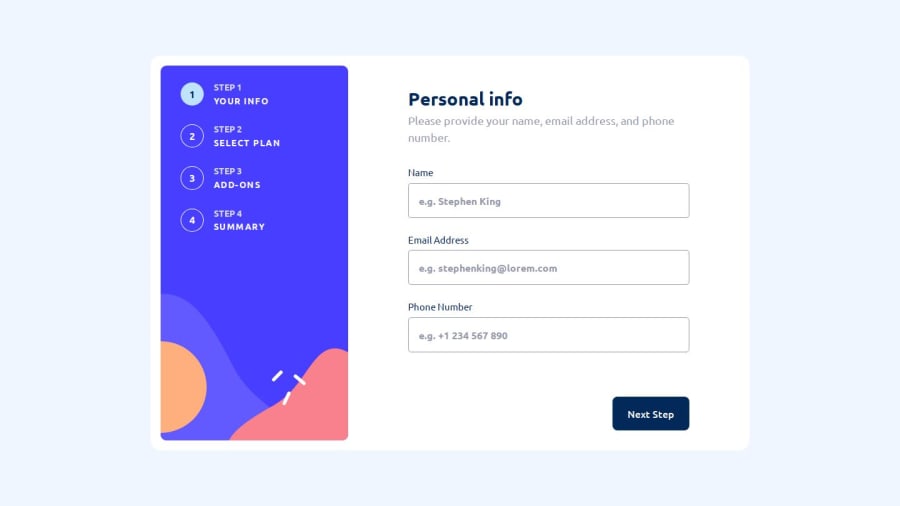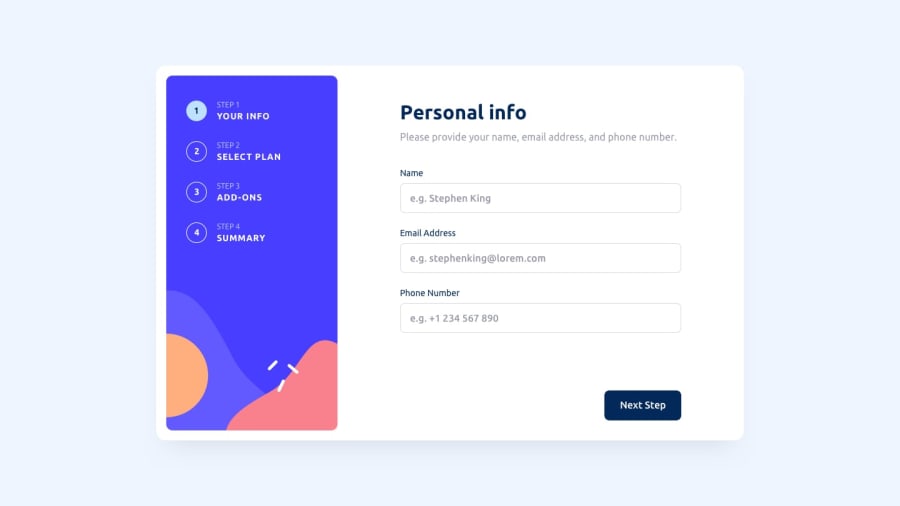
Responsive, Accessible Multi Step Form using Grid, Flexbox and JS.
Design comparison
Solution retrospective
Tried to use the maximum number of variables within the functions that I could. to avoid declaring them globally.
It's the first time I've written so much JavaScript code and I think it's all useful +500 lines, of course there are some things that could be done do to make it better.
i've been learning a little bit about A11y, such as the use of aria-hidden to hide icons and other elements.
In my next challenge I will try to use the mobile first approach for the first time! 😁
Edit: after sending the challenge I just realized that I put the background-color that wasn't the right one... (already updated)
Edit 2: solved some HTML report problems.
What challenges did you encounter, and how did you overcome them?It was very difficult for me to make the mobile design because from a certain width everything began to overflow, what I did was to remove using media querys things like the width, paddings and sizes of some elements.
Bugs
-
I had a bug in the way I update the formStep as there were a few times where the animation and show classes they weren't eliminated, I solved it by iterating on all the form steps that aren't the new step and removing those classes.
-
had a bug that basically every time you went back to a formStep it added an eventListener from animationend and that's what caused it to glitches in the interface, as it ran the same code 1 time for each event... I solved it using the once property.
-
a bug in which I used animations for when you change formStep, before you change the actualFormStep to the nextStep the animation of the actualFormStep started to its initial state and you could see the element for a short time, I solved it using transitions instead of animations.
I'd like to get help on the correct use of media queries and the way I did the design for mobile.
Also if someone could tell me if the way I implemented the Aria attributes I used is okay. 😁
I read in an article that you have to use default width and height in images in the HTML markup to avoid CLS, but I don't know if should use a picture element with different sources for things like icons, I would like help with that.
Community feedback
Please log in to post a comment
Log in with GitHubJoin our Discord community
Join thousands of Frontend Mentor community members taking the challenges, sharing resources, helping each other, and chatting about all things front-end!
Join our Discord
