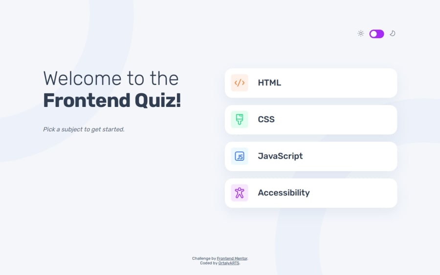
Design comparison
SolutionDesign
Solution retrospective
What are you most proud of, and what would you do differently next time?
Built with:
- Semantic HTML5 markup
- Native CSS
- Vanilla JavaScript
- Mobile-first workflow
- JSON to populate questions
- CSS animations (transition + @keyframes)
- Light / Dark theme switch
- Aria role listbox + option to add accessibility for selecting subjects
- CSS @media (prefers-reduced-motion) + Fallback in JavaScript
Checked with:
- Chrome Screen reader
- Chrome Lighthouse
- PerfectPixel
I am always glad to get any improvement suggestions, especially for accessibility.
Thanks in advance 🍭
Community feedback
Please log in to post a comment
Log in with GitHubJoin our Discord community
Join thousands of Frontend Mentor community members taking the challenges, sharing resources, helping each other, and chatting about all things front-end!
Join our Discord
