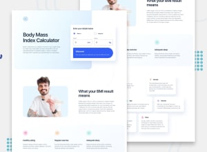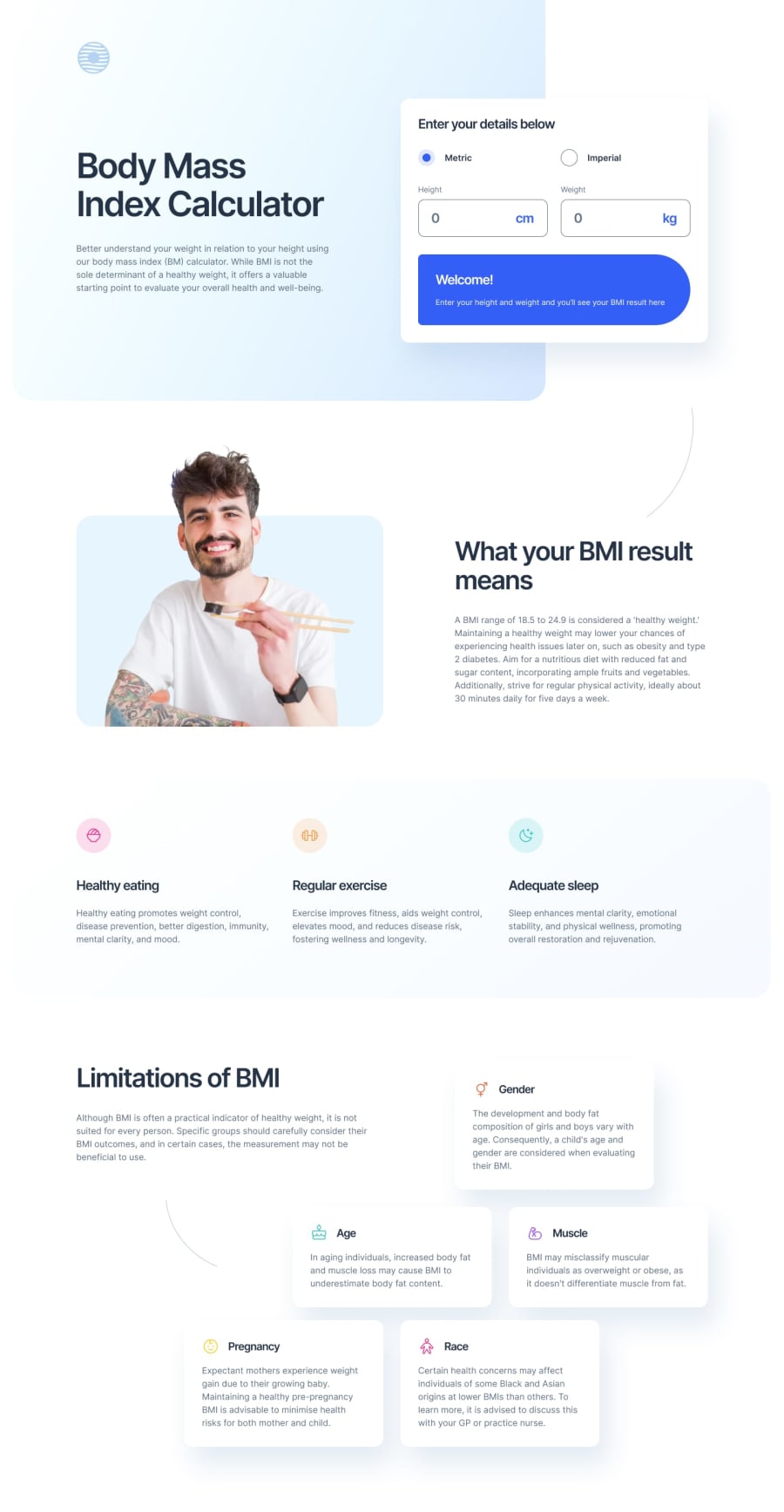
Design comparison
Solution retrospective
My fluency is layout and JS calculations is going up rapidly.
What challenges did you encounter, and how did you overcome them?I tried to make all of the elements keyboard accessible but I am not sure how to make the radio button grouped. I added an 'aria-label' but I'm not sure that's enough.
Community feedback
- @kaamiikPosted 3 months ago
Hello, Good job on your project! I have a few suggestions I’d like to share with you:
-
For groups of radio buttons, consider using the
fieldsetandlegendelements. This is the most accessible approach in this and many other situations. -
Place your logo inside a header section and use an appropriate
aria-labelfor it. -
Your code is not responsive when viewed on different screen sizes. Try to rebuild your HTML and CSS to improve responsiveness.
-
Use the
imgtag for your images and ensure you add appropriatealttext to them.
Additionally, there are some other issues with your CSS. For example, there is no proper CSS reset, and sizes are often defined using
pxinstead ofrem. I strongly suggest seeking more feedback. You can ask questions in the Discord community of the FED mentor.There is some other problems in your css like there is no good css reset and also the sizes are more using
pxinstead ofrem. I strongly suggest take more feedbacks. You can ask questions in Discord community of the FED mentor.0 -
Please log in to post a comment
Log in with GitHubJoin our Discord community
Join thousands of Frontend Mentor community members taking the challenges, sharing resources, helping each other, and chatting about all things front-end!
Join our Discord
