Design comparison
SolutionDesign
Solution retrospective
What are you most proud of, and what would you do differently next time?
Community feedback
- @robinsonexePosted about 1 year ago
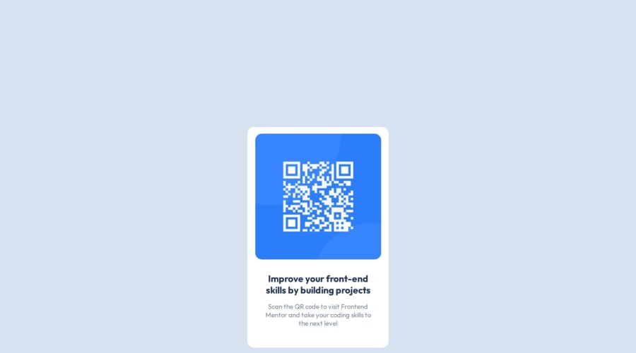
If I'm correct and your solution is on the left labelled "solution" I think the overall design could be centered better. That aside everything else looks amazing and I can tell you used exactly the same color schemes, I had some issues there but I was eventually able to work it out.
0
Please log in to post a comment
Log in with GitHubJoin our Discord community
Join thousands of Frontend Mentor community members taking the challenges, sharing resources, helping each other, and chatting about all things front-end!
Join our Discord
