Design comparison
Solution retrospective
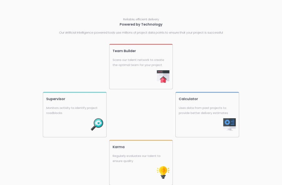
This is my solution to this challenge! I haven't really struggled with this challenge until I had to try and create the grid layout. I gave it a shot and this is as close as I can make it. If you have any tips on how to make it EXACTLY like the design then please comment it so I can improve on it. It's also responsive so I have the mobile and the desktop one so I hope you enjoy this solution and I'll see you later!
Community feedback
- @KevhecPosted over 1 year ago
Hi CybarZoid! Your overall project looks good. However, there are some recommendations you might find useful.
- First of all, your question about positioning using a CSS grid. To solve this and make use of all the power display grid can offer, you should add a grid template right after enabling this display mode. This template has to be according to your needs, in this case, you will need at least 4 grid rows and just 3 grid columns to position the elements as they are in the design. To do this your grid class will be:
@media all and (min-width: 650px) { .grid { display: grid; grid-template-rows: repeat(4, 1fr) grid-template-columns: repeat(3, 1fr); gap: 1rem; } ... }
If you're not familiar with this property I suggest you read the display grid documentation. If you open your developer tools you will see on the elements section that the specific one that has the grid class has a little tag on its right side called "grid". If you click on it the browser will highlight all the rows and columns generated with their specific ids for you to position elements using "grid-row" or "grid-column" on them. This way you can, for example, update your cards__team-builder class to be:
.cards__team-builder { grid-column: 2 / 3; grid-row: 2 / 4; }
I'll leave to you the implementation of the karma box so you can practice 😉.
Another recommendation related to your case is to specify where your grid elements are going to start and end adding on all your
grid-column
orgrid-row
both numbers of the property as in the example above where we tell the element to be positioned starting on row 2 and finish at row 4.Last, but not least, try to add an h1 tag to your projects. If you're not clear about which element should be an h1 you can add a visually hidden one for screen readers only to improve accessibility. And in this same heading flow, ask yourself if the piece of text you're considering a heading represents one. To do this think about the content and if the text you're highlighting describes it (apply this to your h3 on line 25 of your HTML).
I hope you find this useful, Happy coding! 😁
Marked as helpful0@CybarZoidPosted over 1 year ago@Kevhec Thanks for these tips. Will improve it for sure!
0@KevhecPosted over 1 year ago@CybarZoid I'm glad you found it useful, I just updated my reply by adding the grid template column property I missed, If you have any other questions don't hesitate on asking me!
1@CybarZoidPosted over 1 year ago@Kevhec Ok I couldn't really figure out the karma one. They just kept on stacking on top of each one. Can you please elaborate further?
0@KevhecPosted over 1 year ago@CybarZoid If you used on the karma container
grid-row: 3 / 5;
you're getting this issue try to add to your .grid class the propertygrid-auto-flow: dense;
. An updated version of your grid class will be:@media all and (min-width: 650px) { .grid { display: grid; grid-template-rows: repeat(4, 1fr) grid-template-columns: repeat(3, 1fr); grid-auto-flow: dense; gap: 1rem; } ... }
If you still getting problems after doing this please update your github code so I can take a look!
0@CybarZoidPosted over 1 year ago@Kevhec Unfortunately it didn't do anything and I looked up this property but didn't really get it. Oh I also updated the repo so you can check it!
0@KevhecPosted over 1 year ago@CybarZoid The repo is not updated with the last changes, what I can see is yesterday's version. Make sure to push your local code to github
0@KevhecPosted over 1 year ago@CybarZoid Yes I can see now the problem. You have correctly assigned the display property to your cards parent element, the problem are on the cards themselfs.
In grid you use grid-column and grid-row to tell the elements inside wrapped by a container with display grid. These properties are shorthands, in the case of grid-column of grid-column-start and grid-column-end wich specifies the area of your grid where the element should be positioned, for example:
.selector { grid-column: 1 / 2; }
Is the same as
.selector { grid-column-start: 1; grid-column-end: 2; }
And their meaning on the grid is that the element pointed by the selector will be wrapped between the line 1 and 2 representing the columns, open this image to have a better understanding. Now, for you to correctly position your elements on the grid you will need to specify both start and end lines for your grid-column and the same for grid-row. As an example, in the image linked above if you want an item to be positioned on the very center of the grid id shows you will have something like this.
.selector { grid-column: 2 / 3; grid-row: 2 / 3; }
You can see these lines on your own page using your devtools, here is a video showing how to access grid debug mode.
Notice that the numbers of those properties are the same as the number of the lines on the grid, column refering to the numbers on the top and row to the lines on the left. With this, to correctly position your elements you have to check where you want them to start and where to end. Try to do it with this new info.
0
Please log in to post a comment
Log in with GitHubJoin our Discord community
Join thousands of Frontend Mentor community members taking the challenges, sharing resources, helping each other, and chatting about all things front-end!
Join our Discord