Submitted 3 months ago
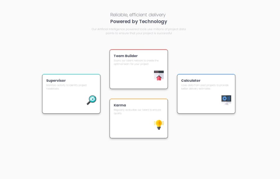
Responsive 4 cards page using CSS Grid, Flexbox ,HTML5
#sass/scss

@Mohamed-Badr-Saad

Design comparison
SolutionDesign

Community feedback
- P@kephaloskPosted about 2 months ago
solid solution :) I had a look at your s/css files and saw this:
main {
    header {
        article {
            width: 100%;
            p {
                width: 60%;
            }
        }
    }
}
That's an over-nested structure. Avoid deep nesting in s/css. It makes the code harder to read and maintain. Better approach is to flatten the structure. This improves readability:
article {
    width: 100%;
}

article p {
    width: 60%;
}
0

Please log in to post a comment
Log in with GitHub
Join our Discord community
Join thousands of Frontend Mentor community members taking the challenges, sharing resources, helping each other, and chatting about all things front-end!
Join our Discord