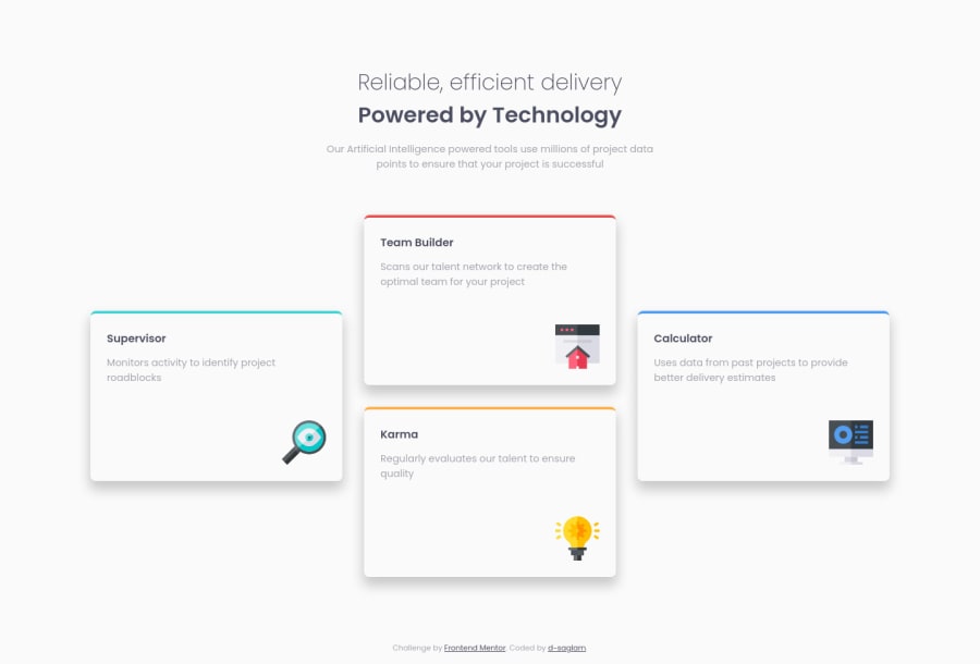
Design comparison
SolutionDesign
Solution retrospective
Hello y'all!
Every comment and suggestion's welcome! Please let me know what I did good/wrong and how I can improve it.
Happy coding!
Community feedback
- @BikeInManPosted almost 3 years ago
Nice work ! Works great on desktop and mobile.
Marked as helpful1@dsaglam94Posted almost 3 years ago@BikeInMan Thank you very much man. It means a lot :')
0 - @Ahmedhassanin12Posted almost 3 years ago
you did it well 🎉✔
Marked as helpful1 - @RioCantrePosted almost 3 years ago
Hello there! Nice work with this project. Looking at your solution, I would suggest the following for you...
- Try increasing the breakpoints from
max-width: 820pxintomax-width:1172px - Import the
attributionstyle in CSS file and removestyletag - Alternative is to use
h3tag rather thanh4
Above all, the design is well implemented. Hope this helps and Keep it going!
Marked as helpful1@dsaglam94Posted almost 3 years ago@RioCantre Hello! Thank you for your advices. I will implement those changes to project and check them. Your advices always help me!
1 - Try increasing the breakpoints from
Please log in to post a comment
Log in with GitHubJoin our Discord community
Join thousands of Frontend Mentor community members taking the challenges, sharing resources, helping each other, and chatting about all things front-end!
Join our Discord
