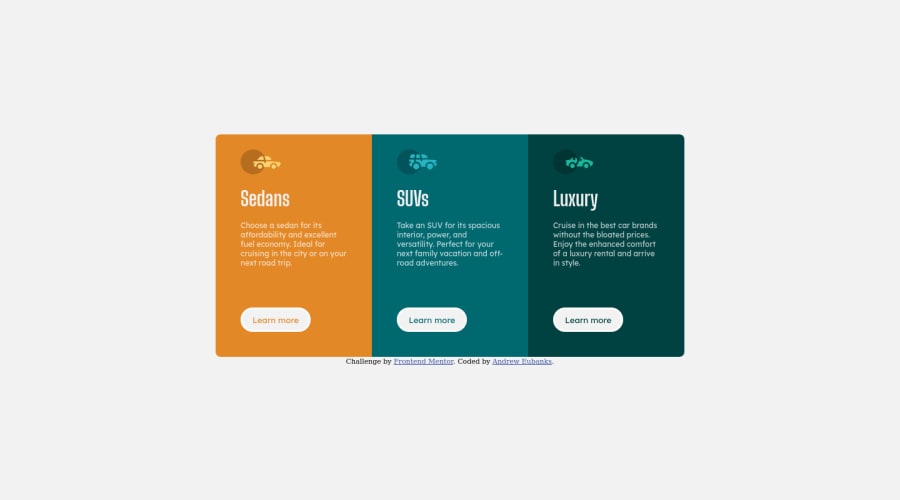
Design comparison
SolutionDesign
Solution retrospective
I was practicing writing my code to be more responsive and maintainable. My attempt was to use as few fixed units as possible on this project, and write my CSS as minimalistic as possible. If you see any way I could improve my code. Please leave me a comment. Any sort of constructive criticism is welcome.
Community feedback
Please log in to post a comment
Log in with GitHubJoin our Discord community
Join thousands of Frontend Mentor community members taking the challenges, sharing resources, helping each other, and chatting about all things front-end!
Join our Discord
