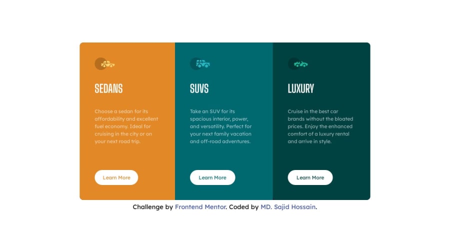
Design comparison
Solution retrospective
give your feedback 🧡
Community feedback
- @Gr3g0ry99Posted over 1 year ago
Hiya, I’m not very familiar with tailwind as it is something that I want to start using soon, but I’m looking at this on a mobile display and you want to get it so the card stack on top of each other rather than next to each other, yet again im not sure what classes you would need with tailwind but you could add custom css with a media query to set the flex as a column, but there’s probably an easier fix in tailwind you may have to look that one up
1@sajidrecPosted over 1 year ago@Gr3g0ry99 Maybe your mobile screen width is more than 375px Style guideline says 375px is mobile screen so I designed according to style guideline. You can use chrome developer tool to see how it appears at small screen. Thank you
0@sajidrecPosted over 1 year ago@Gr3g0ry99 I've updated the breakpoint for mobile view please check. Previously it was set the maximum width to 375px I've updated it to 480px hopefully you'll see better results this time. if you have more feedback please let me know. Thank you.
0
Please log in to post a comment
Log in with GitHubJoin our Discord community
Join thousands of Frontend Mentor community members taking the challenges, sharing resources, helping each other, and chatting about all things front-end!
Join our Discord
