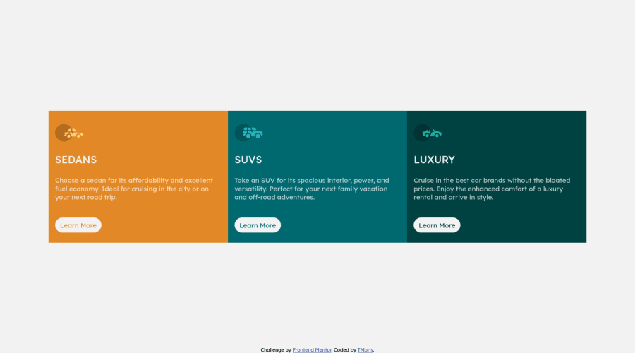
Responsive 3-column-preview-card-component coded using HTML and CSS
Design comparison
Solution retrospective
Another challenge completed, am requesting for any guiding and advise, Thanks
Community feedback
- @TicTac1602Posted over 2 years ago
Hello, very nice work, here's some advices to make it even better:
First, imagine the full width of the desktop version as 5 parts (space, block1, block2, block3, space). By quick maths you know that your container muss do 60% of your body. You can even use 60vw. If you don't know this unit it is a percentage based unit scale based on the viewport the site is displayed on.
Then you could add a bit of padding to your cards, this will shrink naturally the space for the text and make your card taller (as the design).
Finally, you could try to import the correct font used in the tittle of the cards that you can normally find in your "style-guide.md" file.
Again, very nice work!
Marked as helpful1@tmorisPosted over 2 years ago@TicTac1602, Thanks for this advise let me fix up the issues as per your guidance. I appreciate your efforts incurred in making me a good coder.
Thanks once again, best regards.0
Please log in to post a comment
Log in with GitHubJoin our Discord community
Join thousands of Frontend Mentor community members taking the challenges, sharing resources, helping each other, and chatting about all things front-end!
Join our Discord
