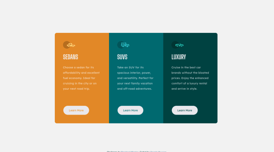
Responsive 3column-preview-card-component
Design comparison
Community feedback
- @denieldenPosted almost 3 years ago
Hi Naveen, I took some time to look at your solution and you did a great job!
Also I have some tips for improving your code:
- remove all
marginfromApp - add
max-width: 22rem;tocardclass - try to use flexbox to the body for center the card. Read here -> best flex guide
- after add
min-heigth: 100vhto body because Flexbox aligns to the size of the parent container
Tip of graphic design: With
font-family:" Big Shoulders Display ", cursivethe browser will use the Comics Sans font when it doesn't find the first font indicated (you can seen during loading) ... for the designer it's a really awful font!- I would rather replace it with a
font-family:" Big Shoulders Display ", sans-serifmuch more similar to the primary font.
Overall you did well :)
Hope this help and happy coding!
Marked as helpful2@Naveen39OPosted almost 3 years ago@denielden Thanks for taking time to review the solution and providing some detailed improvements. This would help me a lot in improving my code and in becoming better front end developer.
1 - remove all
Please log in to post a comment
Log in with GitHubJoin our Discord community
Join thousands of Frontend Mentor community members taking the challenges, sharing resources, helping each other, and chatting about all things front-end!
Join our Discord
