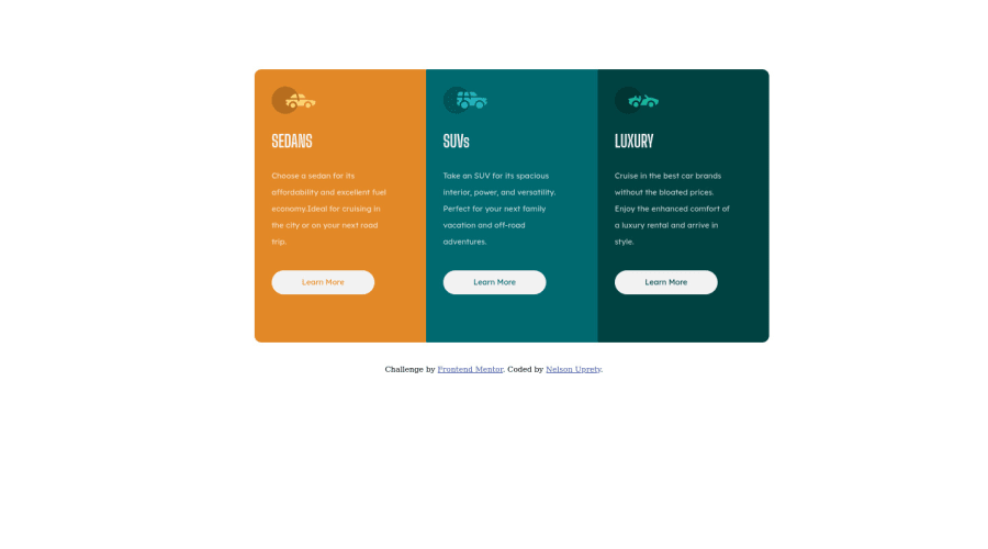
Responsive 3-column-preview-card using HTML and CSS
Design comparison
Solution retrospective
Used CSS grid to complete this project. Utilized grid-auto-flow: column; feature to get the desired layout.
Feedback and comments are welcomed as always.
Community feedback
- @VCaramesPosted over 2 years ago
Hey @nelsonuprety1, great job on this project!
Some suggestions to improve you code:
- For accessibility purposes, it’s best to use rem/em instead of px for your CSS property values.
For media queries, I definitely suggest using em for them. By using px your assuming that every users browser (mobile, tablet, laptop/desktop) is using a font size of 16px (this is the default size on browser). Em's will help with users whose default isn't 16px, which can sometimes cause the your content to overflow and negatively affect your layout.
- To perfectly center your content to your page, add the following code to your <body> element:
body {
    display: grid;
    place-content: center ;
}
Happy Coding!
0
Please log in to post a comment
Log in with GitHubJoin our Discord community
Join thousands of Frontend Mentor community members taking the challenges, sharing resources, helping each other, and chatting about all things front-end!
Join our Discord
