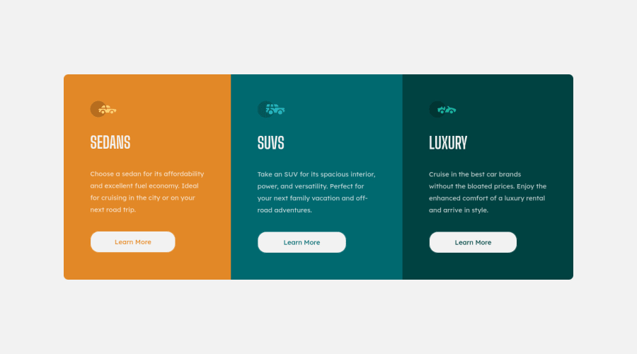
Design comparison
SolutionDesign
Solution retrospective
While i have done quite a few of the newbie challenges on the site, this is my first attempt at a responsive design using relative units and percentages. I did my best to keep the CSS concise. I'd be curious to know if anyone has any best practices suggestions for improving my code. Thank you!
Community feedback
Please log in to post a comment
Log in with GitHubJoin our Discord community
Join thousands of Frontend Mentor community members taking the challenges, sharing resources, helping each other, and chatting about all things front-end!
Join our Discord
