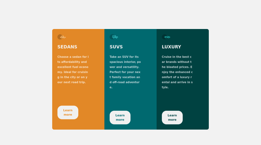
Responsive 3-Column Preview Card, CSS Grid and Flexbox
Design comparison
Solution retrospective
Hello, this is my Solution for the 3-Column Preview Card Challenge.
I'm currently getting into responsive design and hope you can help me getting better at it.
Questions: When looking on a Mobile Device I have a margin at the top of the Screen but not on the bottom, how can I fix this without using negative Margins?
When putting a transition tag on my button to make the hover more smooth the animation always triggers when the Site reloads. How can I prevent this?
Thanks for every Feedback and Tips!
Community feedback
- @PhoenixDev22Posted almost 3 years ago
Hello @ProdByTENSHI ,
I have some suggestions regarding your solution:
- In this case, you can have hidden
< h1>
withsr-only
styling and make the other heading tags to<h2`>
.
.sr-only { border: 0 !important; clip: rect(1px, 1px, 1px, 1px) !important; /* 1 */ -webkit-clip-path: inset(50%) !important; clip-path: inset(50%) !important; /* 2 */ height: 1px !important; margin: -1px !important; overflow: hidden !important; padding: 0 !important; position: absolute !important; width: 1px !important; white-space: nowrap !important; /* 3 */ }
-
Don't capitalise in html, let css text transform take care of that. Remember screen readers won't be able to Read capitalised text as they will often read them letter by letter thinking they are acronyms.
-
Swap the buttons for anchor tags. Clicking those "learn more" buttons would trigger navigation not do an action so button elements would not be right. (Anchor tags are for navigation . Buttons are for actions submitting a form or toggling a content )
-
border-radius
andoverflow hidden
to the main container so you don't have to set it to individual corners. -
Consider using
max-width
. That will let the component grow up to a point and be limited. Usingwidths
in percentage. Not a great idea as you're losing control of the layout. (use max-width in rem) -
Don't set the height Let the content inside the card element dictate the height of it.
-
Create a custom :focus-visible styling to any interactive elements (button, links, input, textarea). This will make the users can navigate this website using keyboard (by using Tab key) easily.
-
For you question , Give the
<body>
min-height: 100vh
andpadding
Hopefully this feedback helps.
Marked as helpful1@ProdByTENSHIPosted almost 3 years ago@PhoenixDev22 Hey, thank you for the response.
I tried using Border-Radius on the main container but nothing changed. I don't know why because on my other Projects with this type of elements I always did it like you said.
0 - In this case, you can have hidden
- @PhoenixDev22Posted almost 3 years ago
Hello @ProdByTENSHI ,
About sections:
- Section is not meant to be used anytime you feel tempted to use a div . section is for a bigger chunk of content often titled by <h2>Read more about the What is the difference between <section> and <div>?
Hopefully this feedback helps
0
Please log in to post a comment
Log in with GitHubJoin our Discord community
Join thousands of Frontend Mentor community members taking the challenges, sharing resources, helping each other, and chatting about all things front-end!
Join our Discord