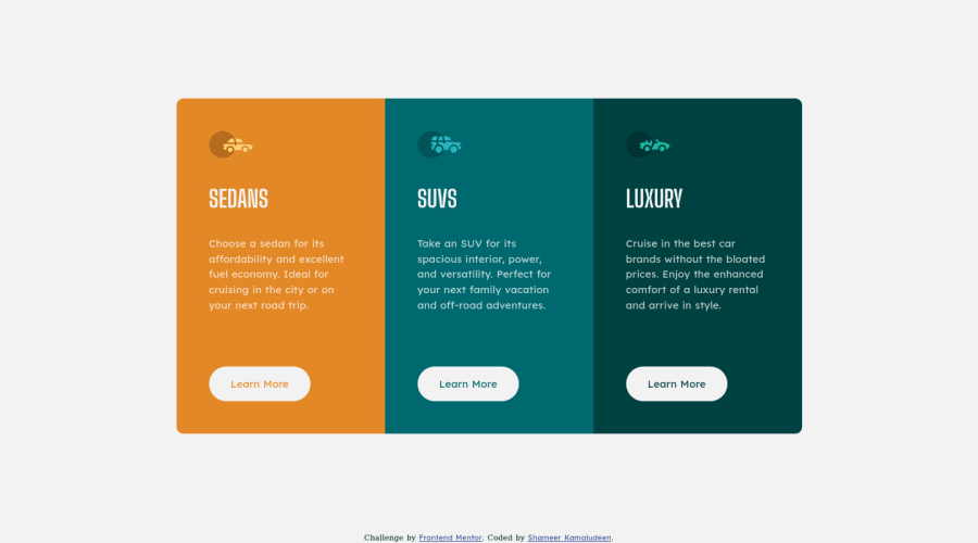
Responsive 3-column preview card component using flexbox
Design comparison
Solution retrospective
Any feedback or suggestions, please
Community feedback
- @denieldenPosted about 3 years ago
Hi Shameer, I took some time to look at your solution and you did a great job!
Tip of graphic design: With
font-family:" Big Shoulders Display ", cursivethe browser will use the Comics Sans font when it doesn't find the first font indicated (you can seen during loading) ... for the designer it's a really awful font!- I would rather replace it with a
font-family:" Big Shoulders Display ", sans-serifmuch more similar to the primary font.
Overall you did well :)
Hope this help and happy coding!
Marked as helpful1@shameerkamaludeenPosted about 3 years agoThanks for your suggestion @denielden
1@denieldenPosted about 3 years ago@shameerkamaludeen You are welcome! I would really appreciate if you mark my comment as helpful if it helped you, thank you very much :)
0@shameerkamaludeenPosted about 3 years agoSure @denielden, actually forgot it.
1 - I would rather replace it with a
- @mayurdehadePosted about 3 years ago
Great work
0
Please log in to post a comment
Log in with GitHubJoin our Discord community
Join thousands of Frontend Mentor community members taking the challenges, sharing resources, helping each other, and chatting about all things front-end!
Join our Discord
