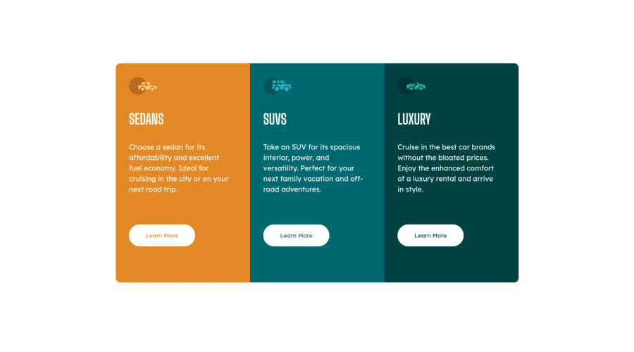
Responsive 3-Column Preview Card Component Using CSS Grid
Design comparison
Solution retrospective
This was by far the most enjoyable challenge I have taken on. It's my first time to use grid and it gives me so much joy that such tool exist, the flexibility and possibilities are basically limitless.
I would love for you guys to take a look at my solution and let me know what you think. Any feedback will be much appreciated.
Community feedback
- @PhoenixDev22Posted about 3 years ago
Hello @ellenearteleg,
I have some suggestions regarding your solution:
HTML
- About
<h1>it is recommended not to have more than one h1 on the page . You can add a<h1>withclass="sr-only"(Hidden visually, but present for assistive tech). Then swap those<h1>by<h2>.
.sr-only { border: 0 !important; clip: rect(1px, 1px, 1px, 1px) !important; -webkit-clip-path: inset(50%) !important; clip-path: inset(50%) !important; height: 1px !important; margin: -1px !important; overflow: hidden !important; padding: 0 !important; position: absolute !important; width: 1px !important; white-space: nowrap !important; }-
For any decorative images, each img tag should have empty
alt=""andaria-hidden="true"attributes to make all web assistive technologies such as screen reader ignore those images in this challenge , all the images are decorative. -
Clicking those
"learn more"buttons would trigger navigation not do an action so button elements would not be right. And for future, it is essential if you include a button in a form element without specifying it's just a regular button, it defaults to a submit button. Though, so it's a good idea to make a habit of specifying thetype. So use<a>instead. -
Don't capitalise in html, let css text transform take care of that. Remember screen readers won't be able to Read capitalised text as they will often read them letter by letter thinking they are acronyms.
-
Using
<section>tag for each card is not really a good choice . Section is not meant to be used anytime you feel tempted to use a div . section is for a bigger chunk of content often titled by<h2>Read more about usage notes -
border-radiusandoverflow hiddento the container that wraps the three cards, so you don't have to set it to individual corners.
hopefully this feedback helps.
Marked as helpful0@elleneartelegPosted about 3 years ago@PhoenixDev22 I was actually debating whether to use button or anchor link and although hesitant, settled for the button. You've covered a lot of the things I don't know yet, so I'm really thankful for your feedback. I will incorporate these into a perhaps a better version if this, or for the following challenges that I will take on. Thank you so much for the additional reference as well!
1 - About
- @kacperkwintaPosted about 3 years ago
Hi! Looks great on mobile, desktop version is nice too. The background color in the design is not white, look there for right color :), and border thickness in buttons hover is more than 1px
Marked as helpful0@elleneartelegPosted about 3 years ago@kacperkwinta that's something I've actually just realized when I've looked at the comparison 😅 definitely will work on training my eyes more! Thank you for your feedback!
0
Please log in to post a comment
Log in with GitHubJoin our Discord community
Join thousands of Frontend Mentor community members taking the challenges, sharing resources, helping each other, and chatting about all things front-end!
Join our Discord
