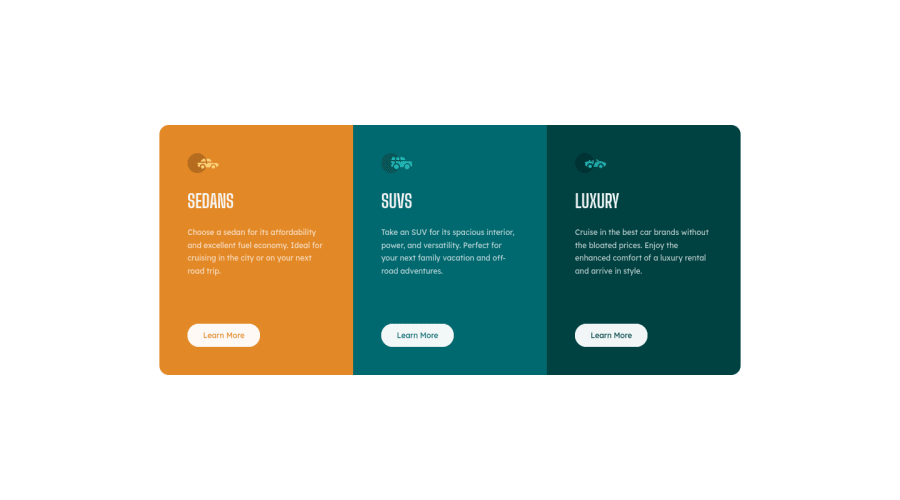
Responsive 3-column preview card component using css grid
Design comparison
Solution retrospective
Though I was able to achieve the desired result, I'm not sure if I am following the best practices. Any help, criticism or feedback is welcome, I am here to learn!
Community feedback
- Account deleted
Hey there! 👋 Here are some suggestions to help improve your code:
-
Along with the blank
Alt Tag, you also want to include thearia-hidden=“true”to your “car images/icons” to fully remove them from assistive technology. -
Implement a Mobile First approach 📱 > 🖥
With mobile devices being the predominant way that people view websites/content. It is more crucial than ever to ensure that your website/content looks presentable on all mobile devices. To achieve this, you start building your website/content for smaller screen first and then adjust your content for larger screens.
- Your CSS Reset is extremely bare and being underutilized. To fully maximize your CSS reset, you want to add more to it.
Here are few CSS Resets that you can look at and use to create your own or just copy and paste one that is already prebuilt.
https://www.joshwcomeau.com/css/custom-css-reset/
https://meyerweb.com/eric/tools/css/reset/
http://html5doctor.com/html-5-reset-stylesheet/
If you have any questions or need further clarification, feel free to reach out to me.
Happy Coding! 🍂🦃
0 -
Please log in to post a comment
Log in with GitHubJoin our Discord community
Join thousands of Frontend Mentor community members taking the challenges, sharing resources, helping each other, and chatting about all things front-end!
Join our Discord
