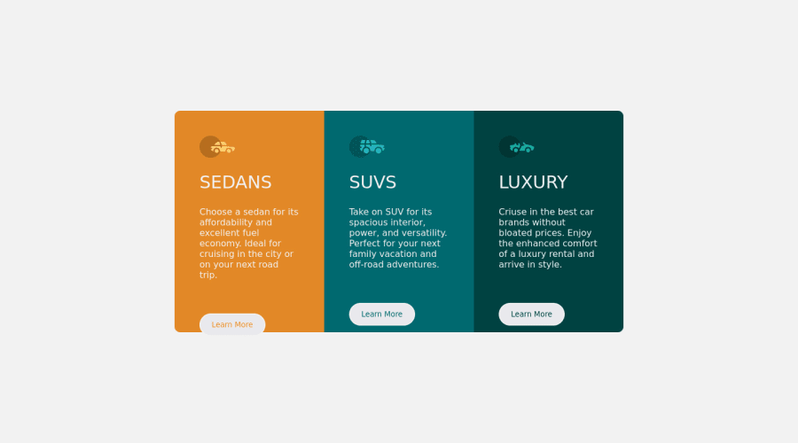
Responsive 3-column preview card component page.


Design comparison

Solution retrospective
I found it difficult trying to set the border radius for the <div class="card-container3> when in mobile view. I also applied the "min-height: 100vh;" CSS property, of which I noticed the scroll bar on the page went missing. I still don't understand how it works.
Any information about this issues will be appreciated.
Please log in to post a comment
Log in with GitHubCommunity feedback
- @vanzasetia
Greetings, Anthony! 👋
Good effort on this challenge! 👍
I notice that the file name of the CSS is
3-column-preview-card-component page.css. It's okay, but it's a very long name. The common names for the CSS file arestyle.css,index.css,styles.css, etc. So, as you may notice they are short and simple.Some more feedback from me.
- I recommend removing the
flex-wrapproperty. I suggest only having two layouts, a one-column layout for mobile and a three-column layout for larger screen sizes. It an "awkward" layout where there are two-column and then one card below it. - If all the card elements have the same styling (like the
widthand theheight), you can create acardclass where it defines the size of the card. This way, if you need to change the size of those cards, you can just change the styling of thecardclass. (the same logic applies to thebtnelements)
<div class="card card--orange"> [...] </div> <div class="card card--light-cyan"> [...] </div> <div class="card card--dark-cyan"> [...] </div>- Also, I use BEM (block__element--modifier) class naming convention. You don't have to learn it, but most people (including me) find it useful for a lot of reasons. Visit https://en.bem.info/ to learn more about BEM.
- (Plot twist) I recommend removing the
widthand theheightproperties from all the card elements. You only need to set amax-widthto themain-containerto prevent those cards from becoming too large on a wide screen. - Use CSS to uppercase the text. The uppercased word in the HTML might be spelled by the screen reader (spelled letter by letter).
- The "learn more" buttons should be links since they are more likely to navigate the users to another webpage (which is the purpose of the link).
Hope you find this useful!
- I recommend removing the
- @faruking
You can use 'media queries' to style elements when they satisfies a certain condition like when in mobile mode. Visit this link to learn more. media queries


Join our Discord community
Join thousands of Frontend Mentor community members taking the challenges, sharing resources, helping each other, and chatting about all things front-end!
Join our Discord