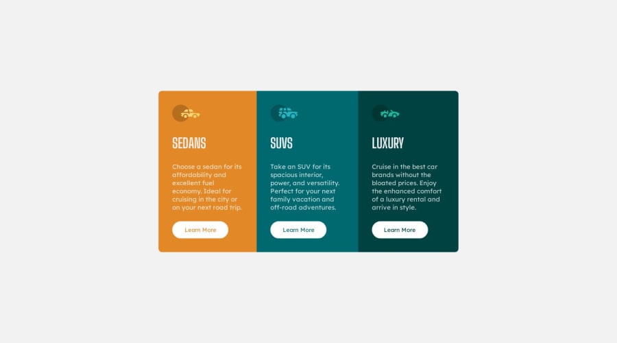
3-column preview card component using Flexbox (Responsive)
Design comparison
Solution retrospective
Feedbacks appreciated : ) Questions :
- How can i improve my page's performance for mobile Devies ?
Community feedback
- @MelvinAguilarPosted 12 months ago
Hello there 👋. Good job on completing the challenge !
I have some suggestions about your code that might interest you.
-
Use only one
<h1>tag per page; use<h2>for section headings. Learn more here 📘. -
Prefer
<a>over<button>for the "Learn More" link, as it navigates to another page. Details here 📘. -
For decorative car icons, leave the alt attribute empty to hide from screen-readers. More details here 📘.
I hope you find it useful! 😄 Above all, the solution you submitted is great!
Happy coding!
0@git-riteshPosted 12 months agoThanks for such insightful suggestions @MelvinAguilar. I'll surely keep that in mind in my next project.
0 -
Please log in to post a comment
Log in with GitHubJoin our Discord community
Join thousands of Frontend Mentor community members taking the challenges, sharing resources, helping each other, and chatting about all things front-end!
Join our Discord
