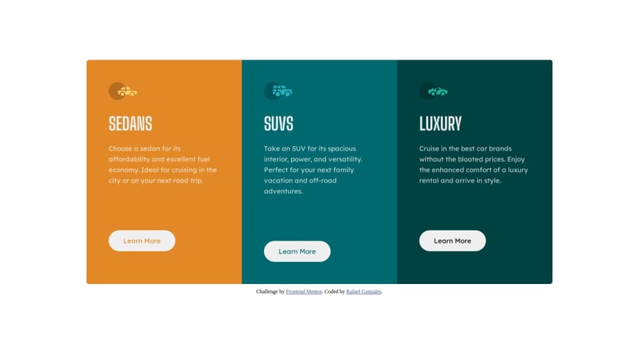
Responsive 3-Column Preview Card built with HTML & CSS
Design comparison
Solution retrospective
Hi all!
Just a quick question: is it okay for me to have this many classes for a challenge like this? Or is there a more efficient way?
For instance, is there a way to write less code to change each background-color of the card-containers and the background-color and text-color of the card-buttons?
Thanks!
Community feedback
- @bbsmoothdevPosted 11 months ago
Hey, overall this is great. It looks exactly like the original.
I agree, the image icons should have
alt=""to hide them from screen reader users because they are purely decorative. Your heading structure looks good now (i.e. each type of car is anh2). Yes, you should switch to single column a little sooner. And I'm still seeing a card get taller than the others as I zoom in.A few accessibility issues:
- The white text on orange background does not have enough contrast to meet minimum accessibility requirements. I understand if those are the colors the design asked for. I won't hold that against you. The designer is the one to blame. Just wanted to let you know that it wouldn't pass an accessibility audit.
- Believe it or not, the white on lighter green in the middle card does not quite have enough contrast either. It's missing by a little, so it's a minor issue. Again, I won't hold that against you.
- The "Learn More" links at the bottom are a common accessibility issue. A screen reader user can navigate by links only. In that case they will hear just "link Learn More" and won't know which car the link is for without having to do some extra work to figure it out. The best solution for this is to use visually hidden text to add the type of car after "Learn More" for each link:
<button class="card-button">Learn More <span class="visually-hidden">about Sedans</span></button>The article The anatomy of visually-hidden has all the info you need on how to visually hide text using the
visually-hiddenclass.Marked as helpful0 - @BlackpachamamePosted 11 months ago
Greetings! you have done a great job 😎
📌 Some accessibility and semantics recommendations for your HTML
- I can only mention an accessibility issue, you can add a short description to your image with the
altattribute. In case it is just a decorative image, such as an icon or logo, you can leave it empty:alt="". More info - Just because it looks bigger does not mean that this text is your main title
- There can only be one
h1per page
📌 Some suggestions
- I'm not convinced that you have defined the media query at
375px, I think it should be a little higher, this would prevent it from looking bad on screens between376pxand1050px - Also, you could have placed
display: flexdirectly in the mobile version with aflex-direction: column, then just changed toflex-direction: row. You can also play around withflex-wrap: wrapalthough here you would have to make extra adjustments
As for your question, I'm afraid not, at least for this case I can't think of a way to make each
sectionhave a different color without applying a different class to each one.Marked as helpful0 - I can only mention an accessibility issue, you can add a short description to your image with the
Please log in to post a comment
Log in with GitHubJoin our Discord community
Join thousands of Frontend Mentor community members taking the challenges, sharing resources, helping each other, and chatting about all things front-end!
Join our Discord
