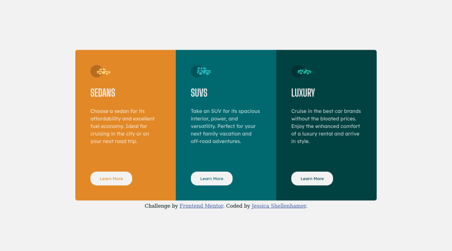
Responsive 3-column layout using grid and flexbox
Design comparison
Solution retrospective
A question that came while I was starting to build this, is:
-
If all sections have the same importance, how do you determine what heading to use since having multiple H1 headings is frowned upon, but in context, it doesn't make sense to have more than one level of heading or have a different type of tag that's styled the same as a heading?
-
I felt like using margin at the bottom of the paragraph to create the spacing was a bit of hack. Is there a better way to do that?
-
I wanted the buttons to remain in the same place regardless of the space taken up by the paragraph. Is there a way to achieve that without using absolute positioning?
-
Any tips to improve the legibility of my code would definitely be helpful.
Community feedback
- @sarahc-devPosted almost 3 years ago
Hey!
- My understanding is that if you are using semantic HTML like <article> or <section> and the heading for each is of equal importance such as in this design and there is no other main heading - it is ok to use multiple h1s.
- Using margin under the paragraph is what is giving you the height of the container. An alternative would be to set a height in rem or vh and use margin-top:auto on the button to push it to the bottom. You have to be careful of the text overflowing at different screen sizes if you do this - but it does keep the button in the same place.
Hope that helps!
Marked as helpful1 - @idesmarPosted almost 3 years ago
Hi Jessica! I think you did a great job with this challenge and you have very valid questions.
Here are my personal opinion regarding your questions?
- Multiple H1: In this challenge/design, there isn't a clear level one heading. There is, however, a way to resolve it. It's by making your own level one heading and applying an
sr-only
class to it to hide it visually but available to screen-readers and web crawlers for SEO. I've seen some web apps that used that approach. The BBC web page is one that I've seen recently. Side note: Please don't usedisplay: none;
to hide elements that you want screen readers to detect. - Spacing between paragraph and button: Using padding-bottom on the container as oppose to margin could be an option. The padding should be of enough size to cover the button, plus some allowance so the
<p>
and button will not touch. - Absolute position on button: There may be other solutions out there but an absolute position combined with padding from the container is the best I can think of right now.
Thanks for reading my thoughts on your questions. Happy coding!
Marked as helpful1 - Multiple H1: In this challenge/design, there isn't a clear level one heading. There is, however, a way to resolve it. It's by making your own level one heading and applying an
Please log in to post a comment
Log in with GitHubJoin our Discord community
Join thousands of Frontend Mentor community members taking the challenges, sharing resources, helping each other, and chatting about all things front-end!
Join our Discord