Not Found
Not Found
Not Found
Not Found
Not Found
Not Found
Not Found
Not Found
Not Found
Not Found
Not Found
Not Found
Not Found
Not Found
Not Found
Not Found
Not Found
Not Found
Not Found
Not Found

Submitted

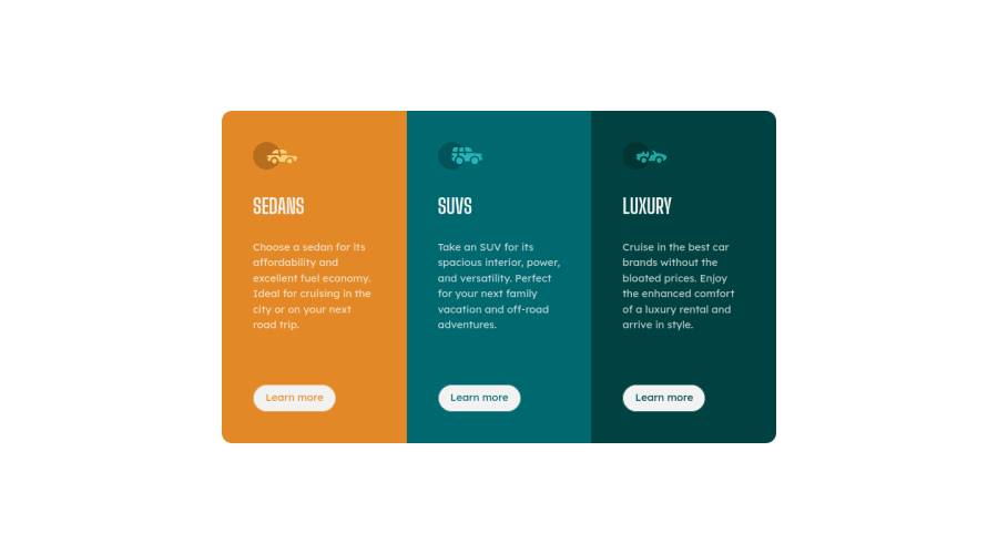
responsive 3 columns preview card using CSS Grid | Flexbox

Cooger 270

@Cooger17

Desktop design screenshot for the 3-column preview card component coding challenge

This is a solution for...

  • HTML
  • CSS
1newbie
View challenge

Design comparison


SolutionDesign

Solution retrospective


Hi everyone! this my solution on this challenge

when building I could'nt fix the alignement on mobile view! i've tried everything to fix it (margin-bottom, justify-content,...) but nothing could fix this issue.

Maybe someone will help me to fix it!

Community feedback

@VCarames

Posted

Hey @Cooger17, some suggestions to improve you code:

  • To give you HTML code structure, you want to set up your code in the following manner (only did parent containers):
  <body>
      <main>
        <article>
          <article class="sedan-card"></article>
          <article class="sedan-card"></article>
          <article class="luxury-card"></article>
        </article>
      </main>
    </body>

The Main Element identifies the main content of the document.

While the Article Element will serve as the card’s container, because the card represents a complete, or self-contained, section of content that is, in principle, independently reusable.

Lastly, each card will be wrapped in their own Article Element because they too, are complete, or self-contained, section of content that is, in principle, independently reusable.

More info:

https://web.dev/learn/html/headings-and-sections/

  • The car images/icons serve no other purpose than to be decorative; They add no value. Their Alt Tag should left blank and have an aria-hidden=“true” to hides it from assistive technology.

  • The headings are being use incorrectly. For this challenge, each heading is equally as important. So best option, is to use <h2> Heading, because it will give each card the same level of importance and it's reusable.

Happy Coding! 👻🎃

Marked as helpful

0
Lucas 👾 104,440

@correlucas

Posted

👾Hello @Cooger17, Congratulations on completing this challenge!

Great code and great solution! I’ve few suggestions for you that you can consider adding to your code:

Use max-width: 100% for the cards in the mobile version to allow the cards grow 100% of the width considering the paddings and avoid to have a lateral gap (limited by a fixed width).

✌️ I hope this helps you and happy coding!

Marked as helpful

0

Please log in to post a comment

Log in with GitHub
Discord logo

Join our Discord community

Join thousands of Frontend Mentor community members taking the challenges, sharing resources, helping each other, and chatting about all things front-end!

Join our Discord