

Design comparison

Solution retrospective
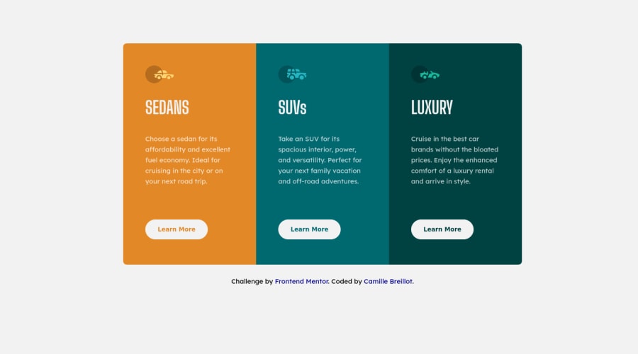
Hello frontend mentors community, I would love to have some feedbacks on the approach I took regarding media queries (adapt card to desktop and to mobile). What could I have done better ? Especially regarding responsiveness of the cards size. Thank you very much in advance, Camille
Community feedback
- @marisudrisPosted over 3 years ago
Great solution! I concur with @darryncodes that you should try to use semantic elements as much as possible, i.e. changing attribution's tag to
<footer>or enclosing it in one. As for the images - if they're purely decorative (as in this case) - leave the alt tag empty (alt="") - this has the same effect as tacking onaria-hidden="true"- assistive devices & screen-readers won't pick it up, and from what I've read - this is considered the canonical approach for "hiding" purely decorative images from assistive devices. Here's one resource on this topic: https://www.w3.org/WAI/tutorials/images/Marked as helpful1 - @darryncodesPosted over 3 years ago
Hi Camille,
Excellent solution, really well done!
You could consider designing mobile-first and using
min-widths. I've linked an article that completely changed my approach - I hope you enjoy it!Secondly you could clear your accessibility report if you add
alt-textto your images oraria-hidden="true"as those images could be deemed decorative. Here is some more info on aria-hidden. Also swap<div class="attribution">with<footer class="attribution">, semantics is really important.Happy coding!
Marked as helpful1@CamilleBreillotPosted over 3 years ago@darryncodes thank you very much for your feedbacks! and thanks for the article it's very insightful :)
0


Please log in to post a comment
Log in with GitHubJoin our Discord community
Join thousands of Frontend Mentor community members taking the challenges, sharing resources, helping each other, and chatting about all things front-end!
Join our Discord