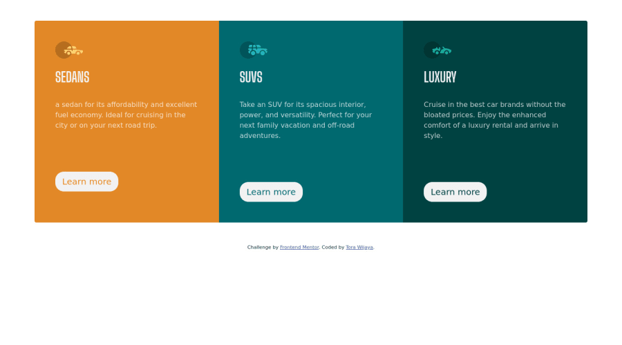
Responsive 3 column preview with html css boostrap
Design comparison
Community feedback
- @correlucasPosted about 2 years ago
👾Hello Tora Wijaya, Congratulations on completing this challenge!
Great code and great solution! I’ve few suggestions for you that you can consider adding to your code:
1.You made your html structure entirely with
div blocksbut these div doesn't any semantic meaning, for this reason is better you use a better html markup improving your code, for example for each vehicle card you use<article>instead of the<div>.2.Add the correct color for the background, that in this case is
background-color: #F2F2F23.Use
<main>instead of a simple<div>this way you improve the semantics and accessibility showing which is the main block of content on this page. Remember that every page should have a<main>block and that<div>doesn't have any semantic meaning.✌️ I hope this helps you and happy coding!
Marked as helpful0 - @VCaramesPosted about 2 years ago
Hey @Torawijaya, some suggestions to improve you code:
-
I suggest staying away from using Bootsratp until you understand the fundamentals.
-
To center you card to your page, add the following to you Body Element:
body { min-height: 100vh; display: flex; justify-content: center; align-items: center; flex-direction: column ; }- Currently you HTML Code has no structure. To better structure your content and make it a lot clearer, you want to implement Semantic HTML.
Why use Semantic HTML?
- Accessibility: Semantic HTML makes webpages accessible for mobile devices and for people with disabilities as well. This is because screen readers and browsers are able to interpret the code better.
- SEO: It improves the website SEO, or Search Engine Optimization, which is the process of increasing the number of people that visit your webpage. With better SEO, search engines are better able to identify the content of your website and weight the most important content appropriately.
- Easy to Understand: Semantic HTML also makes the website’s source code easier to read for other web developers.
More Info
https://developer.mozilla.org/en-US/docs/Learn/HTML/Introduction_to_HTML/Document_and_website_structure
https://www.freecodecamp.org/news/semantic-html5-elements/
https://dev.to/poulamic/writing-semantic-html-3436
-
Your "buttons" were created with the incorrect element. When the user clicks on the button they should directed to a different part of you site. The Anchor Tag will achieve this.
-
While having interactive content (cards, links, icons, buttons, etc…) can definitely make content less static, if not done properly, it can actually have negative effect on your users experience. By simply just applying a “hover” effect to your content, you’re assuming that every device is compatible with “hover” effects. Unfortunately, most devices are not. To provide your users a better experience, you can use the @media (hover: hover) . Now users that that are devices that are not “hover” compatible will be able to enjoy your content.
More info:
https://css-tricks.com/solving-sticky-hover-states-with-media-hover-hover/
Happy Coding!
Marked as helpful0@Mirare23Posted about 2 years ago@vcarames Thank you so much for your help, i learn a lot from you
0 -
Please log in to post a comment
Log in with GitHubJoin our Discord community
Join thousands of Frontend Mentor community members taking the challenges, sharing resources, helping each other, and chatting about all things front-end!
Join our Discord
