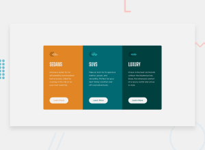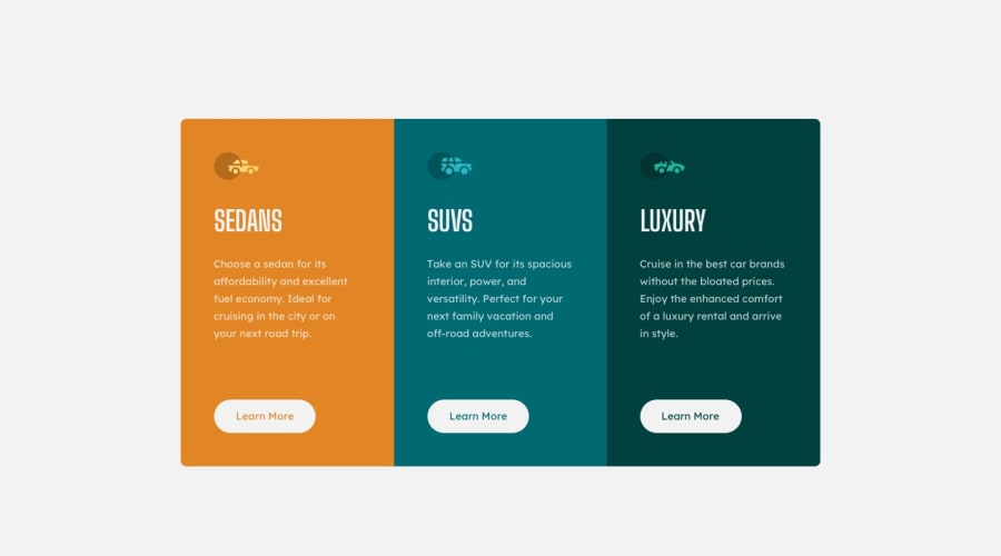
Design comparison
Solution retrospective
I learned a ton with this challenge, any pointers or tips welcome!
Community feedback
- @pikapikamartPosted about 3 years ago
Hey, awesome work on this one. Layout in desktop looks fine, it is just bit smaller but it's fine for now, the responsiveness really needs an adjustment on this one since the layout is really squished before mobile transition. Also, do not use 375px as a breakpoint, that and the 1400px are just the size where the design is made and not the breakpoint. Also it would be great for you to start with mobile first workflow as this will make your layout more adaptable.
Some other suggestions would be:
- It would be great to have a base styling with:
html {
  box-sizing: border-box;
  font-size: 100%;
}
*,
*::before,
*::after {
  box-sizing: inherit;
}
This will make your element easier to handler. You can search up more about
box-sizing: border-box;- Always have a
mainelement to wrap the main content of your page. On this one, the#containershould be using themaininstead ofdiv. - Also, I saw usage of
idfor selecting an element, don't, it is a bad practice because of css specificity, useclassto select an element. - Each car icons are just decoration so hide them. Decorative image must be hidden at all times by using
alt=""and extraaria-hidden="true"attribute on theimgtag. - Also when using
altattribute, avoid using words that relates to "graphic" such as "icon" and others. Animgis already an image/graphic so no need to describe it as one. - A page must have a single
h1on a page. Since there are no text-content that are visible that could beh1, you will make theh1screen-reader only text. Meaning this will be hidden for sighted users and only be visible for screen-reader users, search aboutsr-onlystylings and see how it is used. Theh1text should describe what is the main content is all about, thish1would be placed as the first text-content inside themainelement. Have a look at Grace's solution on this inspect the layout and see how she used theh1and the styling applied to it, copy that since you will use that a lot. - I would use
atag instead ofbuttonbecause it looks more likely a link to "learn more" rather thanbuttonto control something. - The
.attributionshould be inside afooterso that it is contained inside a landmark element. - Lastly, just the responsiveness and mobile layout breakpoint to be adjusted.
Aside from those , really great work again on this one.
Marked as helpful0
Please log in to post a comment
Log in with GitHubJoin our Discord community
Join thousands of Frontend Mentor community members taking the challenges, sharing resources, helping each other, and chatting about all things front-end!
Join our Discord
