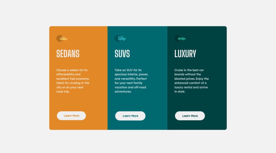
Responsive 3 column preview component using flexbox
Design comparison
Solution retrospective
Only difficulty I found was getting the buttons close to the design. I would love feedback on best practices and how I could have more efficiently achieved the same results.
Community feedback
- @kiantpetersenPosted over 1 year ago
You could also try and incorporate CSS grid for the 3 columns. It is not entirely necessary as it can provide the same results as using flex-box but its a good way to practice the skill.
1@AmeerMoustafaPosted over 1 year ago@kiantpetersen Yes very fair. I will eventually re-do it with grid!
0
Please log in to post a comment
Log in with GitHubJoin our Discord community
Join thousands of Frontend Mentor community members taking the challenges, sharing resources, helping each other, and chatting about all things front-end!
Join our Discord
