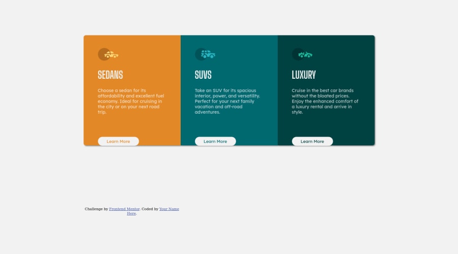
Design comparison
Solution retrospective
I'm not sure what to ask here, but let me just try: How good is the semantics? Is there a way I can do a thing better instead of something I used? What do I stop doing? What do I start doing ?
Community feedback
- @nottohavePosted about 3 years ago
Hello Supa, @Jos02378 kindly shared me this article and I thought that would help with replacing the padding px to em or rem. So check this out: em, rem, px and more.
Other things I think you should do:
- Definitely comment your CSS code more.
- Try to add more meaningful name to your class.
- Pay more attention at the design and try to match with it.
I can not find your html file so I can't say much about the semantics. I am not a great practitioner so I hope another pro can help answering your questions more specifically. But yea, awesome work! I hope these tips can help you out. Peace.
0@SupaSibsPosted about 3 years ago@nottohave Well I guess I know how to do 1 and 2, and I will try and use em or rem values later, but I'm confused on 3. I know that my design isn't a perfect replica but I don't think it has to be, so, Also there is an index.html right after you press view code.
0
Please log in to post a comment
Log in with GitHubJoin our Discord community
Join thousands of Frontend Mentor community members taking the challenges, sharing resources, helping each other, and chatting about all things front-end!
Join our Discord
