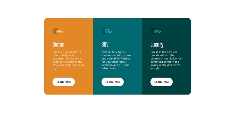
Design comparison
Solution retrospective
Here's my version of the 3 Column Preview Card project. Any feedback would be appreciated!
Community feedback
- @pikapikamartPosted over 3 years ago
Hey, great work on this one. The layout in desktop looks great, responsiveness could be better since right now, at point 898px going down to 760px, horizontal scrollbar appears. Mobile layout however looks great.
Some suggestions would be:
- No need to set
font-size: 16pxon thebodytag, by default it uses16pxor1rem. - Always have a
mainelement to wrap the main content of your page. For this one, the.containershould usemainelement instead ofdiv. - The icons for each car should be using
alt=""and add an extraaria-hidden="true"attribute on the tag. A decorative image needs to be hidden using the mentioned method. - Avoid multiple
h1on a page, only use at least 1h1per page, since there are no suitable visibleh1on the site, you will need to make theh1a screen-reader only text, it will use ansr-onlyclass. Have a look at Grace's solution on this one inspect the layout and see how she uses theh1as well as the styling that she used on thath1. - Cars title should be
h2. - Using
atag would be better instead ofbuttonfor thelearn moresince it looks more likely a link rather than just a control. - Lastly, just the responsive, you should take a look on what I mentioned at first.
Aside from those, great work again on this one.
Marked as helpful1@ljmarket13Posted over 3 years ago@pikamart hey thanks for the feedback and these suggestions will definitely help me improve!
0 - No need to set
Please log in to post a comment
Log in with GitHubJoin our Discord community
Join thousands of Frontend Mentor community members taking the challenges, sharing resources, helping each other, and chatting about all things front-end!
Join our Discord
