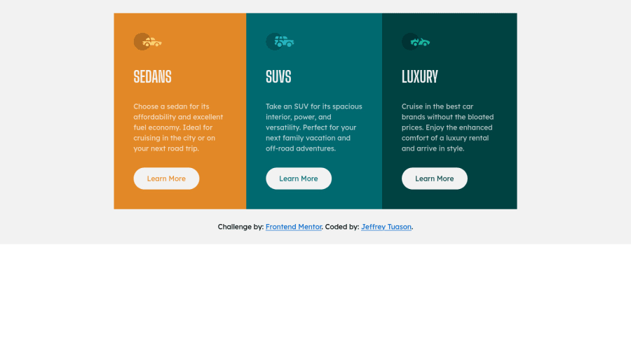
Responsive 3 Column Preview Card Component Using HTML and CSS
Design comparison
Solution retrospective
I hope there's someone gonna look at my code and critic my coding skills so I can improve it.
Community feedback
- @afrusselPosted over 3 years ago
Your main container is not center align both vertical and horizontal. Use display flex, align-item center and others. Also use background-color in body tag
1@Tuason066Posted over 3 years agoHi Mr. @afrussel,
Thank you for your feedbacks on my work. I'll make sure that I'm gonna apply it next time.
-Tuason
0 - @VladimirBrscicPosted over 3 years ago
Hi, your cards are styled pretty well but generally content needs to be centered on the screen. For example you can stretch <body> acros screen with min-height: 100vh and set background color here. Then you can center that preview section with flexbox by adding : display: flex; flex-direction: column; justify-content: center; align-items: center; padding: 2rem 0; to the <body> element. All properties on preview section are not needed then. Happy coding!
0@Tuason066Posted over 3 years agoHi @VladimirBrscic,
Thank you for your informative feedback. I'll make sure that I'm gonna apply your ideas in my coming works.
-Tuason
0
Please log in to post a comment
Log in with GitHubJoin our Discord community
Join thousands of Frontend Mentor community members taking the challenges, sharing resources, helping each other, and chatting about all things front-end!
Join our Discord
