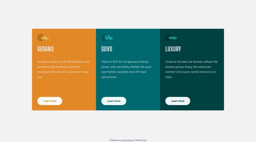
Responsive 3 Column Preview Card Component Using Grid & Media Queries
Design comparison
Community feedback
- @Kamlesh0007Posted over 1 year ago
Congratulations on completing the challenge! That's a great achievement, and I'm sure you put a lot of effort into it. I really liked the way you approached the challenge and the code you wrote. You demonstrated a good understanding of the concepts and applied them effectively to solve the problem.I have a few suggestions to improve your code further. You can wrap up .attribution class within <footer> as a part of semantics.Wrapping the .attribution class within a <footer> element is a great way to improve the semantics and structure of your code. By using the appropriate HTML elements for their intended purpose, you enhance the accessibility and readability of your website.
Here's an example of how you can wrap the .attribution class within a <footer> element:
<footer>
<div class="attribution">
Challenge by
<a href="https://www.frontendmentor.io?ref=challenge" target="_blank">Frontend Mentor</a>. Coded by <a href="https://www.frontendmentor.io/profile/Abd90x" target="_blank">Abd</a>.
</div>
</footer>
By enclosing the attribution content within the <footer> element, you clearly indicate that it is a part of the footer section of your webpage. This is beneficial for assistive technologies and search engines, as they can better understand the structure and hierarchy of your content.
Marked as helpful0@Abd90xPosted over 1 year ago@Kamlesh0007 Thank you for your help. I am grateful to you for taking the time and effort to provide advice and review my solution.
0
Please log in to post a comment
Log in with GitHubJoin our Discord community
Join thousands of Frontend Mentor community members taking the challenges, sharing resources, helping each other, and chatting about all things front-end!
Join our Discord
