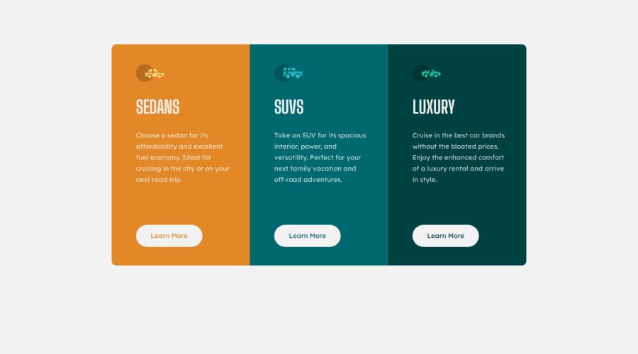
Responsive 3 column preview card component project
Design comparison
Community feedback
- P@Islandstone89Posted about 1 year ago
HTML:
-
You are using landmark elements wrong. A
<header>is used for content that repeats on every page, like a navigation bar with a logo.<main>is used to wrap all of the main content, and is vital for accessibility, as it helps screen reader users to navigate.<footer>is used for things like sitemaps, social media links, etc, at the bottom of a page. Remove<header>and<footer>, and wrap everything else in a<main>. -
The icons are decorative, so the alt text should be empty:
alt="". -
There should only be one
<h1>on a page. Given there are 3 similar headings, I would change all of them into a<h2>. -
"Learn More" is a link, so don't wrap it in a
<button>.
CSS:
-
Always include a proper CSS Reset at the top.
-
Remove the margin on the card container. Instead, you should use Flexbox to center it horizontally and vertically. Add this on the
body:
display: flex; flex-direction: column; justify-content: center; align-items: center;-
Except for the icons, remove ALL widths and heights.
-
Remove
flex-wrapandflex-grow, they are not needed. -
Paragraphs have a default value of
font-weight: 400, so there is no need to declare it. -
line-heightmust never be inpx. -
You only need one media query, which must be in rem. It is common to do mobile styles as the default, so give the card container a
flex-direction: column. When the layout has enough room to grow (use the DevTools' responsive mode to see how it looks on different sizes), change toflex-direction: row. You might need to give the cards aflex-basis: 100%to make them all equal.
NB: I would recommend using Grid for this challenge since we want 3 equal columns. It would look like this, again on the card container:
display: grid;
grid-template-columns: 1fr;
When there is room to grow, change it to:
grid-template-columns: 1fr 1fr 1fr;Good luck :)
0@JamesolukanniPosted about 1 year agoThank you.. This is helpful even though I feel it's worth stating that I attempted the challenge with the knowledge I've gained so far and I'm yet to learn about property:value pairs like display:grid, flex-basis and whatnot but thanks for the feedbacks @Islandstone89
1 -
Please log in to post a comment
Log in with GitHubJoin our Discord community
Join thousands of Frontend Mentor community members taking the challenges, sharing resources, helping each other, and chatting about all things front-end!
Join our Discord
