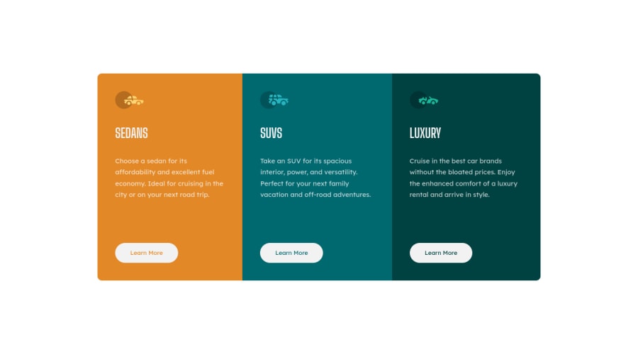
Design comparison
SolutionDesign
Solution retrospective
Hello everybody. Here is my solution for this challenge. I hope you have some advices for me :) Thank you so much :)
Community feedback
- @darryncodesPosted almost 3 years ago
Hi Ekrem,
Really good solution - well done!
Minor things you could consider:
- adding
cursor: pointer;to your button styles - adding
max-width: 400px;(px just a guide here)margin: 0 auto;to.cardwhen your design changes to a column for the mobile layout so it doesn't stretch all the across the viewport - swapping
<div class="main"><main class="main">to clear your accessibility report. Using descriptive mark up is really important
All the best!
Marked as helpful1@ekremilkanPosted almost 3 years ago@darryncodes Thank you very much Darryn. I will be more careful to write clean code. That was really good feedback for me.
0 - adding
Please log in to post a comment
Log in with GitHubJoin our Discord community
Join thousands of Frontend Mentor community members taking the challenges, sharing resources, helping each other, and chatting about all things front-end!
Join our Discord
