Not Found
Not Found
Not Found
Not Found
Not Found
Not Found
Not Found
Not Found
Not Found
Not Found
Not Found
Not Found
Not Found
Not Found
Not Found
Not Found
Not Found
Not Found
Not Found
Not Found

Submitted

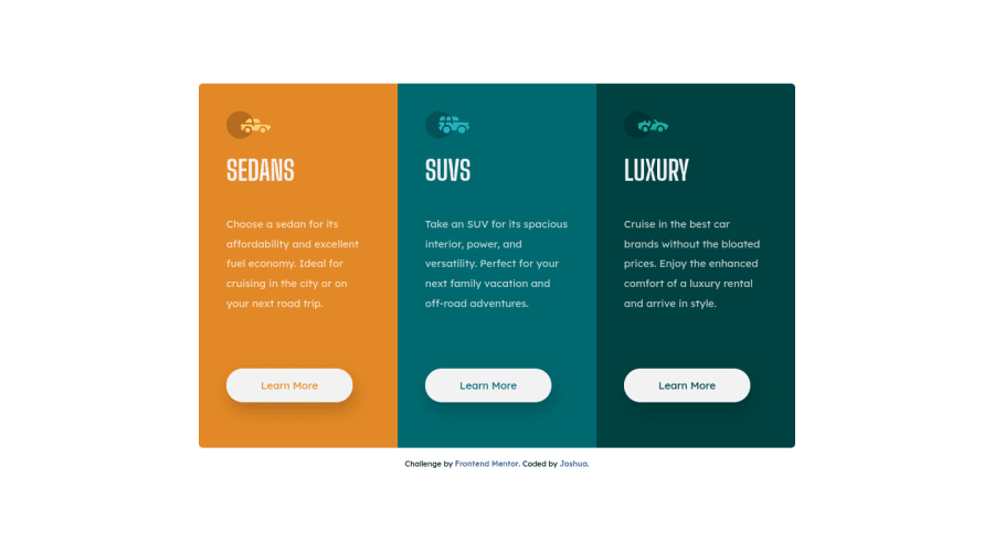
Responsive 3 Column preview card component

Joshua 130

@dyntbn

Desktop design screenshot for the 3-column preview card component coding challenge

This is a solution for...

  • HTML
  • CSS
1newbie
View challenge

Design comparison


SolutionDesign

Solution retrospective


Hey everyone,

Not exactly sure media query target is good enough or just overthinking this. 🤔

The design readme specifies for 375px target for mobile devices, but my coded design is too large even before hitting this target. So, I made it target 900px so it wouldn't overflow.

Is that the right solution, or would the correct solution be to incrementally make a series of media queries to make the design smaller until the target 375px is reached?

I was in a "rabbit-hole" of redesigns as it scaled smaller, but as a went further along I stopped the "time-sink", feeling that it wasn't into spec, and I scrapped the code.

I would like to make a revision to this project, as I am stuck and very invested at this point! Thank you for reading and I would love to hear your thoughts! 😄

Community feedback

@AlazarG19

Posted

nice solution but u forgot to change the background color remove the shadows from the button since that is not required and the thing about making the flex direction column starting from 900px if u give your main tag a css property width:85vw or width:65vw depending on any margin u gave it will be responsive until 800px or something like that thats what i did

Marked as helpful

3

Joshua 130

@dyntbn

Posted

@AlazarG19

Good eye, with BG color and shadows, mine didn't catch that! 😅

Also, I see what you mean by scaling it with vw on the main tag, that just makes scaling so much easier. It's a very elegant solution, compared to what I was doing before.

I ended up adding another media query targeting 800px. I used vw for the main tag to auto-control the responsiveness, then used px to protect the readability of the layout. I also used a combination of width, min-width, and max-width to help with layout shifting.

I'm almost done with my new solution. I'll be updating the GitHub repo soon and creating another solution post on here. Thank you so much Alazar, you really helped me out a bunch. 😄

1

@AlazarG19

Posted

@dyntbn its my pleasure

1

Please log in to post a comment

Log in with GitHub
Discord logo

Join our Discord community

Join thousands of Frontend Mentor community members taking the challenges, sharing resources, helping each other, and chatting about all things front-end!

Join our Discord