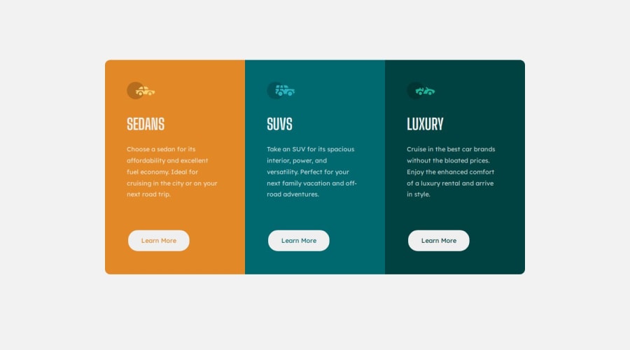
Responsive 3-column layout with active states using Sass


Design comparison

Solution retrospective
I'm proud of my speed and confidence approaching these types of layouts recently. I feel I can take on the task and get it done efficiently without detouring due to unforeseen errors too much.
I need to pay more attention to my use of <main> vs <body> tags. The reason being, I noticed I wasn't landmarking my HTML with a <main> tag, which isn't great practice, namely because I didn't have varied content on these designs, so there was nothing else to differentiate <main> from. However, I don't want to get into a bad habit, but now I sometimes target <body> with sizing when I should be targeting <main> instead. This caused a conflict later on that confused me, and I could have avoided.
As I said, conflict between <main> and <body>. I want to use both moving forward and work out the kinks in this detail so I don't overlook it again.
I had some difficulty with the active states but only because I was confusing it with hover which I now understand are very different, as well as from focus, too.
I used a desktop-first workflow which meant I had to adjust my use of media queries to use max-width and work backwards in the breakpoints. This was a bit finnicky, but I somehow find it easier than a mobile-first flow because there is less work to do in making the design responsive when you do the bulk at the beginning, in my opinion.
I'd like feedback on my Sass. I tried to make better use of it this time, incorporating nesting, mixins, variables and partials. I'd like to go deeper over time, though. I find that writing careful Sass makes me understand my CSS better, which I appreciate.
I couldn't figure out how to remove the previous border-radius settings on the mobile design in the media queries. Those settings weren't behaving as I'd expect. I tried targeting specific corners, as well as a general border-radius attempt (I learn that this is actually shorthand, which is good to know). This bugged me a lot, so help would be appreciated.
Please log in to post a comment
Log in with GitHubCommunity feedback
- @jacob-briscoe
First of all, I think you did a great job with this challenge! I like that you used sass it is seems appropriate. I also noticed the border-radius still showing. Did you try using
border-radius: unsetwithin your media-queries?Also, I haven't completed this challenge yet but I was looking at the requirements and my first thought was to make the styling as generic as possible for the columns. I noticed in your sass that you have specific names for the columns
...sedans, ...suvs, and luxury. I believe you could change it to be generic in the sense that if you want to target for example the first column you can target it directly with css:first-childor:last-child. I encourage you to look at the css pseudo selectors available to you to see how you could make this generic that way it doesn't matter what content is within the columns.Also, regarding the sass -- on a larger project you would want to break this file up more. But, for this example it is perfectly fine to include it all within one file.
Overall, nice job it looks pretty good!
Marked as helpful

Join our Discord community
Join thousands of Frontend Mentor community members taking the challenges, sharing resources, helping each other, and chatting about all things front-end!
Join our Discord