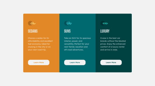
Responsive 3 column layout webpage HTML5,CSS3,Flexbox and Grid
Design comparison
Solution retrospective
Any advice on the layout would be appreciated. And if there is a way to make the buttons stay on the same line regardless of the content before them would be a perfect tip for me:)
Community feedback
- @darryncodesPosted about 3 years ago
Hi Nuray, another really great solution - well done!
This is what you'd need to do to push the buttons down to stay on the same line:
.parent { display: flex; flex-direction: column; }
.parent .child { flex: 1; }
I think you may have over-used flex properties in your solution and they're conflicting. Your
.wrapper
class is redundant, you could just use the.box
class for your styles. And you don't needdisplay: flex;
on your button for the desired outcome.This is an awesome resource by css tricks - great to reference each time you code a solution.
All the best 🤙
0@ganbnurayPosted about 3 years ago@darryncodes what do you mean by parent and child? the parent of the button is wrapper so do i need to remove wrapper so the parent becomes box and I apply those flex properties to box and button?
0@darryncodesPosted about 3 years agoHi @ganbnuray sorry if i wasn't clear.
I just mean what ever class you choose to be the parent so in your current example
.box
looks like the parent element adddisplay: flex;
andflex-direction: column;
.Then the children will need to be your
<img>
<h1>
<p>
and<button>
. Then addflex: 1;
to the<button>
this would be the child element to your.box
class.At the moment you have a few extra
<div>
's that aren't needed and are becoming the flex children, not the 4 above that you want to manipulate.1
Please log in to post a comment
Log in with GitHubJoin our Discord community
Join thousands of Frontend Mentor community members taking the challenges, sharing resources, helping each other, and chatting about all things front-end!
Join our Discord