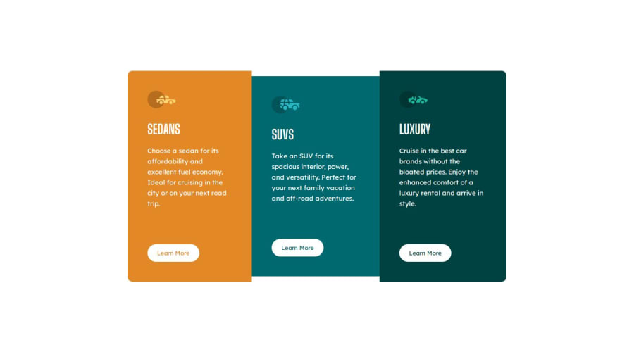
Design comparison
SolutionDesign
Community feedback
- @tburettePosted 10 months ago
Nice solution. The CSS is simple to read and does the job in few lines!
Instead of
.btn:hover{}you could do.btn:hover, .btn:focus. It is better for accessibility : it makes the CSS works if people use keyboard navigation (tabbing).You could use more semantic elements in your HTML :
<main>,<footer>,<section>,...0
Please log in to post a comment
Log in with GitHubJoin our Discord community
Join thousands of Frontend Mentor community members taking the challenges, sharing resources, helping each other, and chatting about all things front-end!
Join our Discord
